“An intensely talented UI/UX leader and designer, but what truly sets him apart is his exceptional collaboration skills.”


I'm a UI/UX and Brand Designer with 20 years of experience. I transform ideas into clear, impactful designs that drive businesses forward.

How I work
Each project follows a clear process of collaboration, from understanding the client's needs to creating the brand and user experience, through to final delivery.
I listen to clients, asking the right questions to fully understand their needs, goals, and user challenges.
Kind words
Incredibly grateful for the feedback from the amazing people I've had the privilege to work alongside.
Read more on LinkedIn“An intensely talented UI/UX leader and designer, but what truly sets him apart is his exceptional collaboration skills.”
“Not only is he an incredibly capable design and UX asset, but a bloody nice bloke to boot.”

“Diesel is friendly and humble. He's skilled at his job and always up-to-date with new UI technologies.”

“Diesel's work significantly improved our software's aesthetics and usability. I highly recommend him.”

“His ability to simplify user experience and deliver quality outcomes in complex scenarios has been invaluable.”

“Diesel has an excellent ability to balance practical product development with business and technical needs.”

“Diesel has brought to life several projects. He works easily with clients and delivers results.”

“Diesel is a switched-on entrepreneur at heart. He works efficiently, communicates effectively and presents with purpose.”

“Diesel is super efficient and adaptive. I was impressed with his ability to manage multiple complex projects at the same time.”

Work

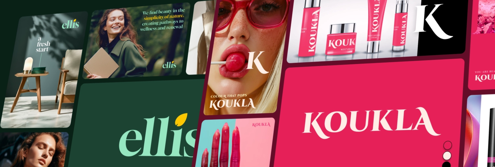
I founded LaunchHuman to create bold, memorable brand identities that truly reflect who you are. Every project is handled with a personal, hands-on approach to ensure the design aligns with your vision. With a focus on human-centered creativity and transparent pricing, LaunchHuman is dedicated to helping your brand make a lasting impact.
Founder
Creating a brand identity is deeply personal, and capturing that essence requires more than just following trends or templates. The challenge has always been to translate the core of a business into a design that’s not only visually striking but also meaningful and lasting.
It’s the feeling when everything clicks, and a brand becomes more than just design. That's the driving force behind LaunchHuman. The reward that comes from seeing a brand identity come to life in a way that truly reflects who the client is. It's about crafting something meaningful that stands out and resonates.
I take a hands-on approach to every project, ensuring that each brand identity is built with care and intention. Where needed, I collaborate with skilled designers from my network and oversee the project, making sure that every brand we create leaves a lasting impact.
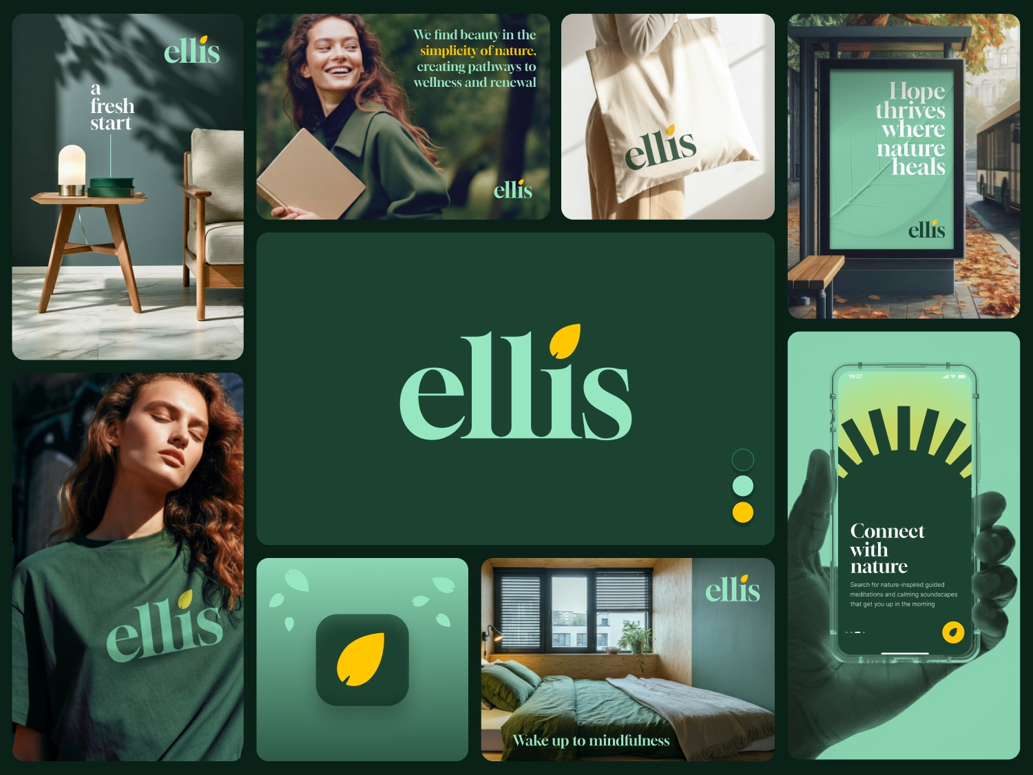
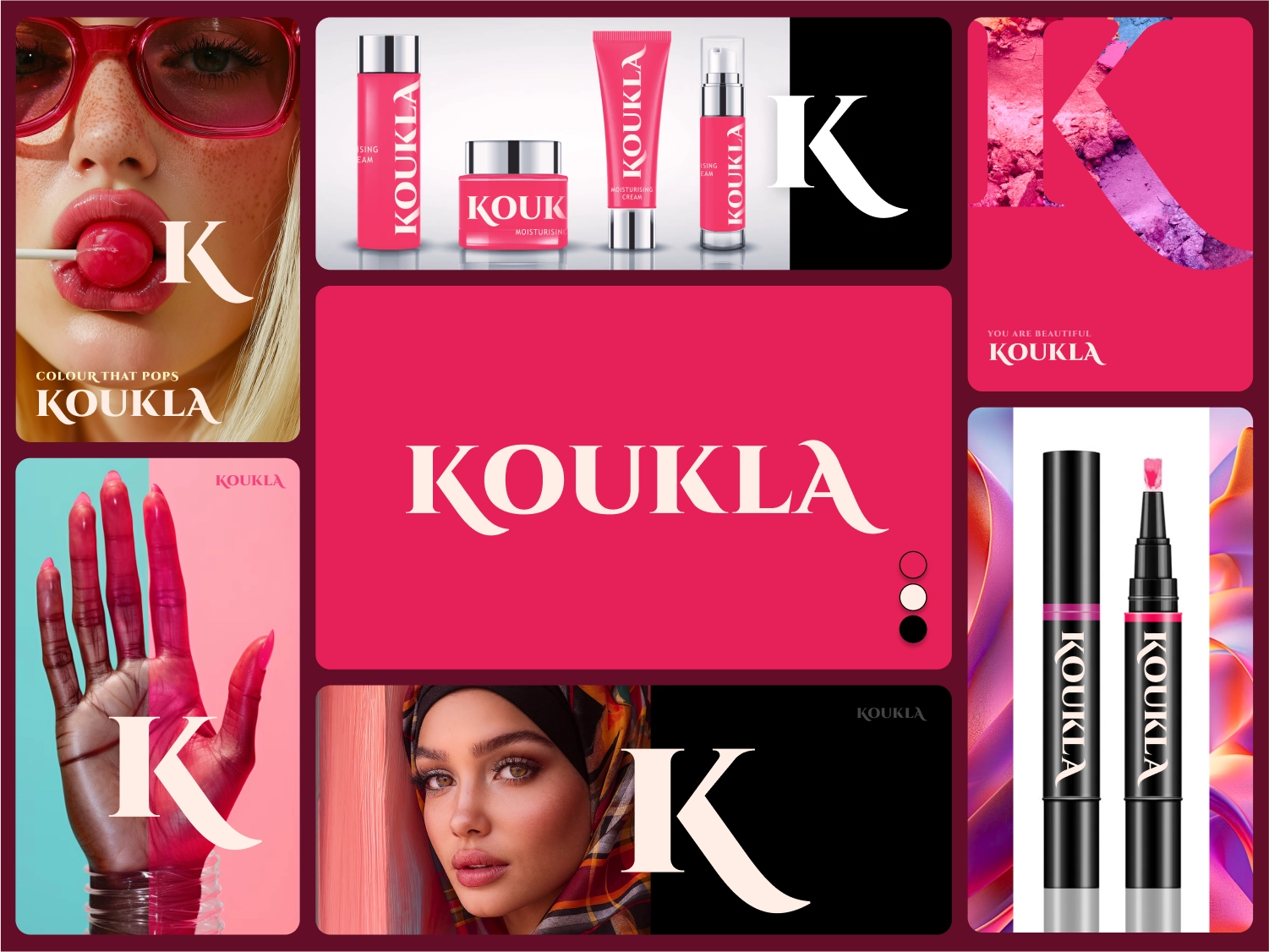
Creating a brand is so much more than designing a logo or picking colors. A true brand reflects the values, aspirations, and personality of the people behind it.
When we build a brand together, we focus on three core elements:

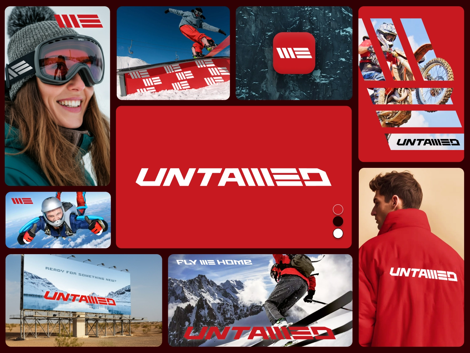
Transparency is key when it comes to pricing, and that's why our rates are fully visible - a rarity in the design world. Instead of relying on complicated quotes or lengthy email exchanges, we provide clear pricing upfront. This way, you know exactly what you're paying for, with no hidden costs or surprises along the way.

Racing Victoria required a complete uplift of their All Star Mile website and voting system; a platform that allows the public to help shape the race’s starting lineup. I led the collaborative effort with stakeholders to design and prototype a solution with a strong design, secure voting system, and simplified user experience.
Racing Victoria
3 months
Client Liaison, Workshop Facilitation, UI Design, UX Design
Design the new All Star Mile website and voting platform with Racing Victoria's refreshed marketing guidelines, ensuring an engaging design, secure voting system, and simplified user experience.
Our kickoff workshop with Racing Victoria was about figuring out the key drivers for their All-Star Mile website. We focused on getting an overview on the core features during the session, including briefly covering the flow of how users would arrive at the voting page:
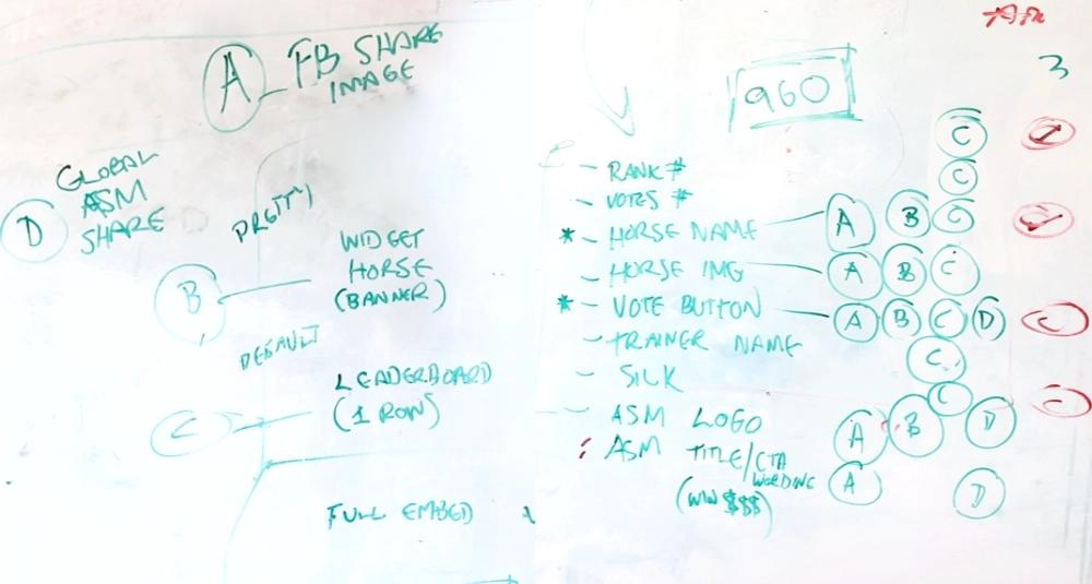
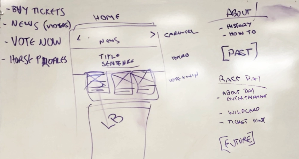
Given that the platform’s overall structure was largely based on previous years and the page count was minimal, I opted to create and work from high-fidelity UI designs from the start. This approach also allowed us to incorporate Racing Victoria’s brand colors and styles right away, which made it easier for the marketing team to review and provide feedback early on.
Working in high fidelity helped in a few key ways:
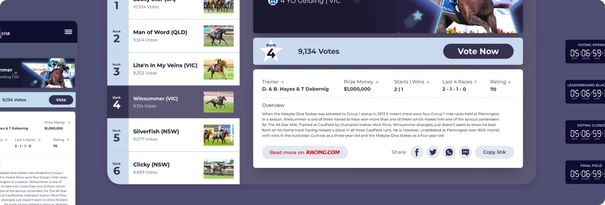
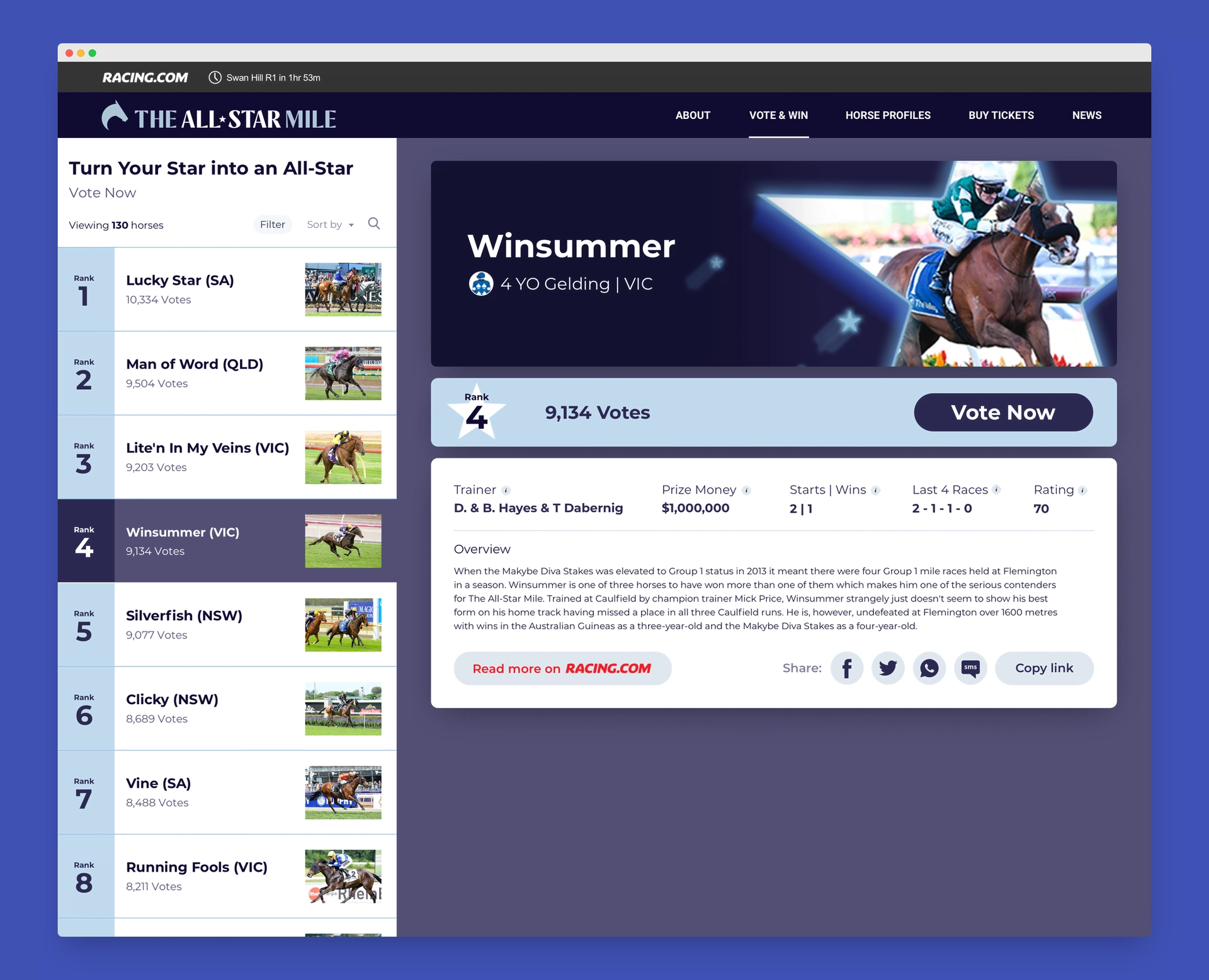
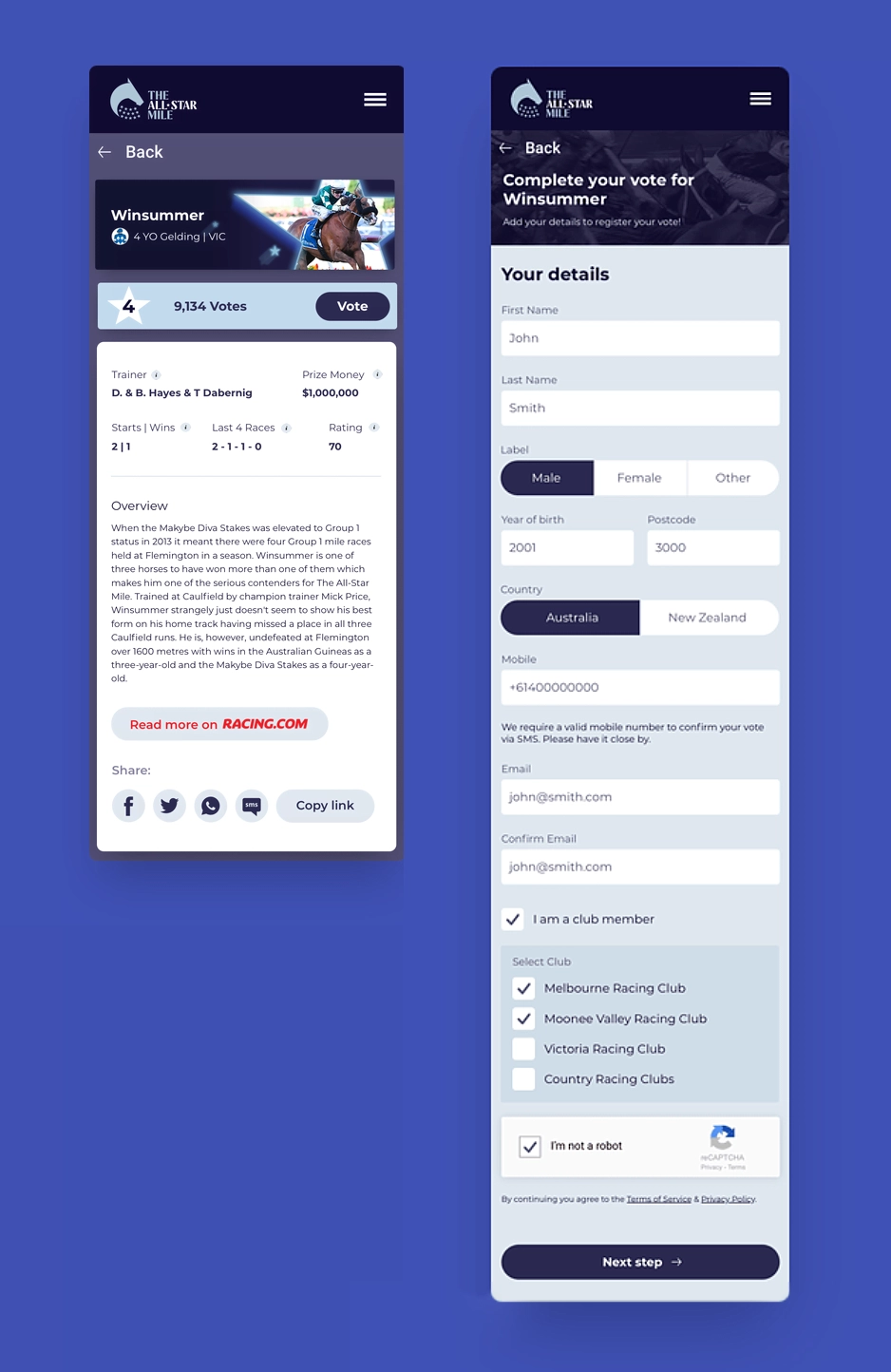
The final design maintained a user-friendly flow, similar to past years, but with one key change. Previously, users would click on a horse from the list to view detailed information on a separate page. We streamlined this process by creating a more integrated, single-page experience. Now, the voting list appears on the left with basic details, while the right-hand side displays the full horse profiles. This layout allowed users to quickly browse, review, and vote without unnecessary navigation. This adjustment made the process far more efficient and engaging, contributing to the platform’s overall success.
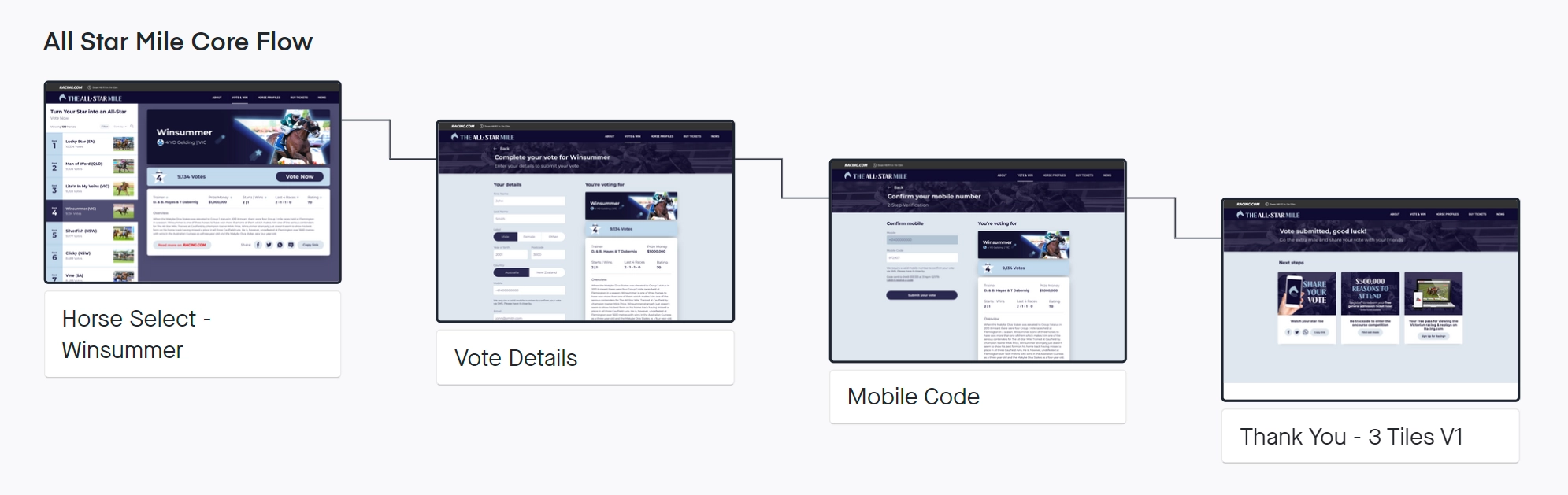
Each of the platform’s core screens was carefully designed to support a seamless user experience and keep the voting process quick and efficient. By focusing on clarity and functionality, we ensured that each page guided the user smoothly through the necessary steps without unnecessary complexity.
This page was the starting point for users, showcasing a streamlined list of horses on the left side. Key information such as horse names, rank, and votes was displayed, while detailed profiles for each horse were shown on the right side. This combined design allowed users to make quick comparisons and vote without ever leaving the page, significantly reducing friction in the process.
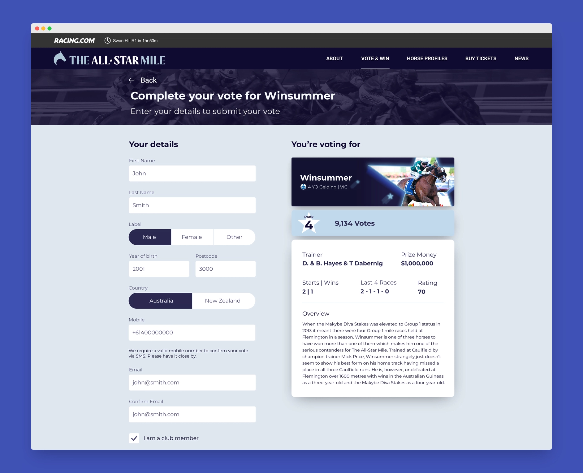
After selecting a horse, users were taken to a simple screen to confirm their choice and enter the required voting details.
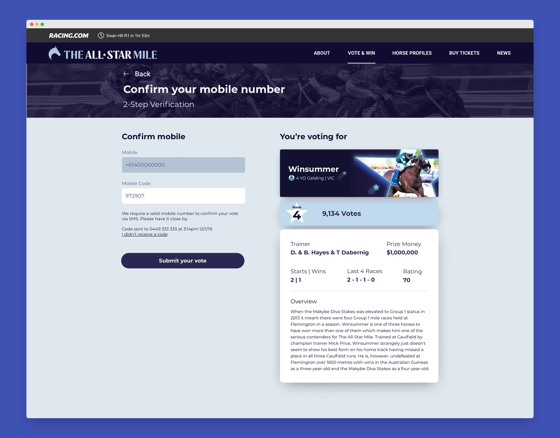
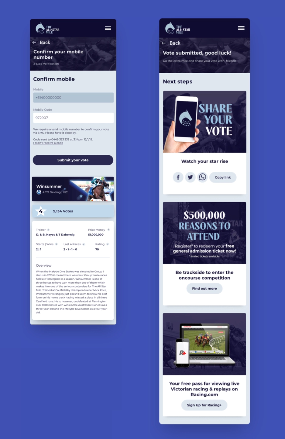
To ensure the integrity of the voting system, this screen asked users to verify their mobile number. We kept this step straightforward and secure, with clear instructions and minimal input fields to make verification as quick and painless as possible.
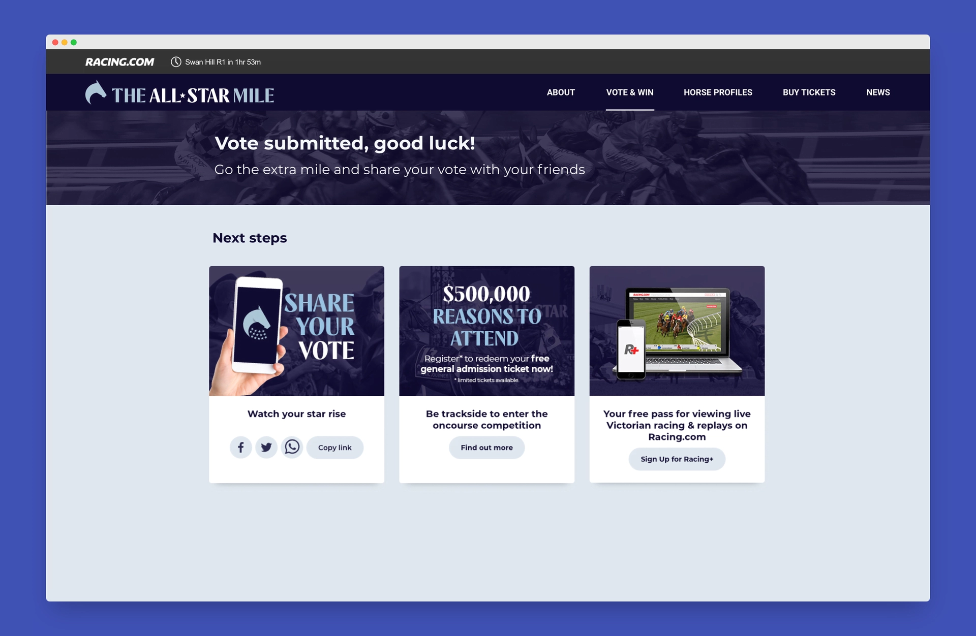
The final page thanked users for their vote and outlined the next steps, including what to expect after voting. The design was kept minimal, focusing on clarity while reinforcing Racing Victoria’s branding. This final touch helped drive further engagement including sharing their vote, buying tickets to the track and siging up with Racing+ to watch the event.
Every page was designed with a mobile layout built-in, knowing that a fair majority of votes would come from mobile devices. The layout, interactions, and content were optimised for smaller screens, ensuring that users could easily navigate, vote, and verify their information without hassle.
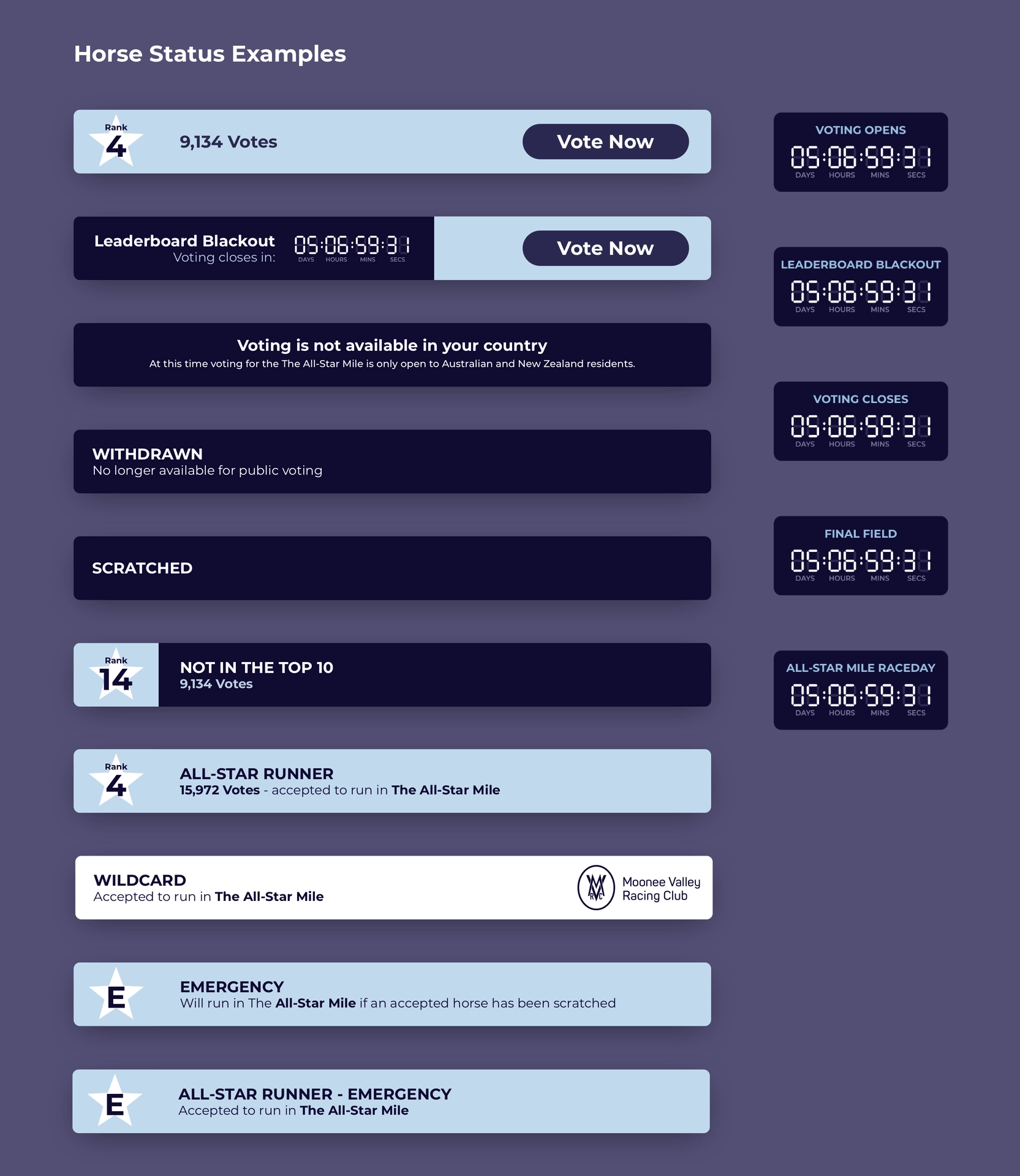
On the horse voting details page, there is an interactive status bar located beneath each horse's image, providing real-time updates to the placement of the horse in the race, and the status of the race itself. This feature was essential in communicating each horse's status efficiently while keeping context to the race as a whole.
Additionally, there is a digital clock widget that appeared throughout the site, displaying key countdowns like time until voting opens, leaderboard blackout, voting closes, final field announcement, and All-Star Mile raceday.
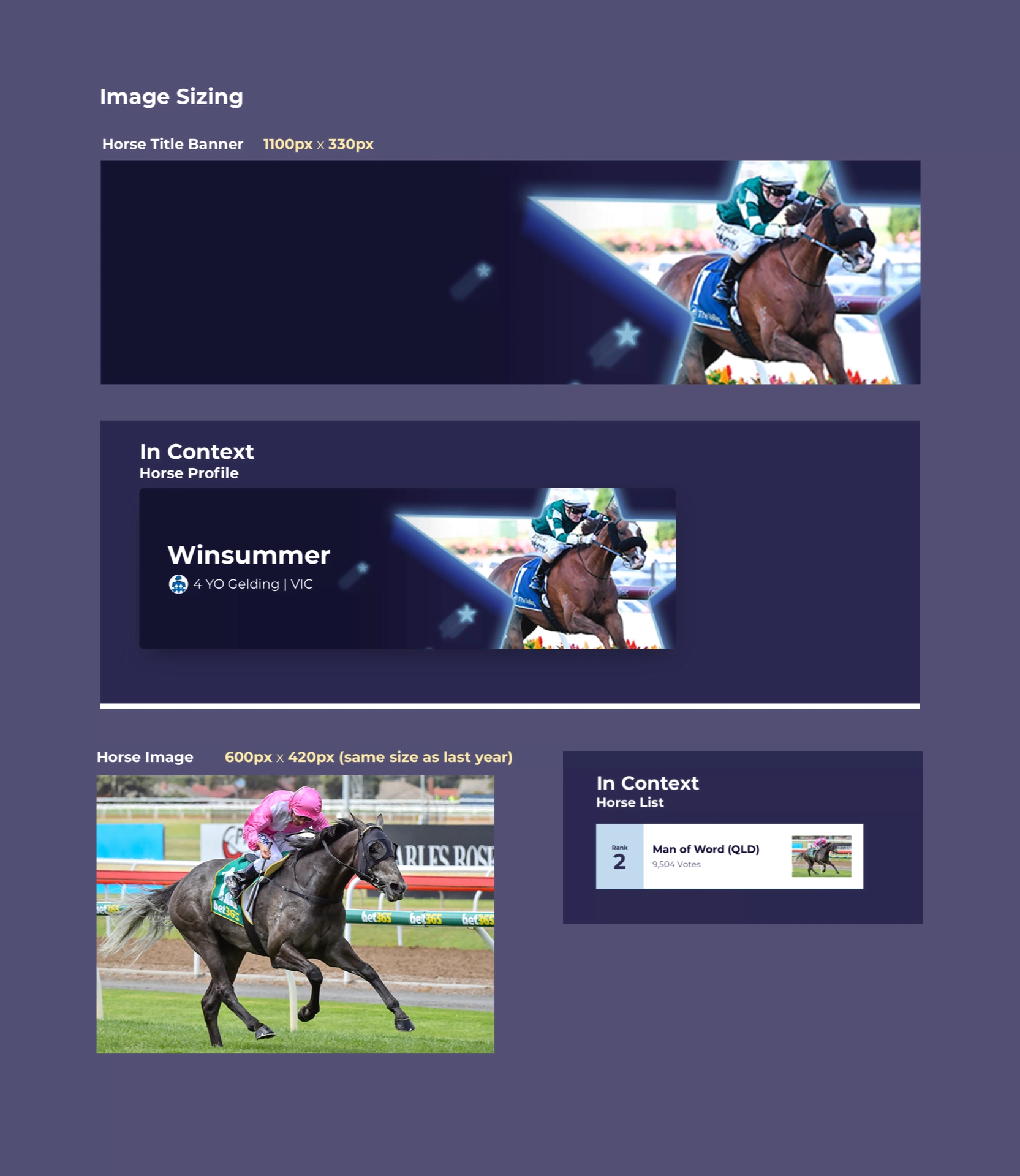
To make sure Marketing had a clear guide to work from, we presented the general sizing for all horse images, including the custom star image mask above each horse's picture. These design elements adhered to the marketing team's guidelines, ensuring brand consistency across the platform.
Racing Victoria gave great feedback on the initial designs, especially the mobile layouts, which resonated well with their expectations. Only minor adjustments were needed, such as tweaking the wording on the mobile confirmation screen for better clarity. We also fine-tuned the flow of information on the voting screen to ensure the best possible user experience.
Overall, working in high fidelity proved to be a smart approach in this case. It allowed us to align much of the content quickly and make necessary refinements with ease, delivering a polished product within the short timeframe.
Throughout the project, I worked closely with our engineering team and Project Manager, ensuring smooth collaboration between the front-end design and the back-end development. This close-knit approach allowed us to build the platform efficiently, with the back-end being developed alongside the front-end UI designs. When it came time to hand off the final designs, I shifted to working directly with the engineering team to assist and guide as requested. Racing Victoria was kept in the loop throughout this process, ensuring they were up to date with every key milestone.
A key factor in this whole build was the mobile confirmation step, which greatly reduced the number of unverified votes in the system, leading to a much cleaner and more accurate voting process. This also extended to the blocked voting in other countries, blocking unauthorised votes throughout the process. This improvement, along with the more user-friendly interface, resulted in an increase in total votes compared to the previous year and significantly fewer support tickets and “lost” votes.
The project was delivered on time and delivered on Racing Victoria’s expectations. They were a driven and motivated team to work with and I thoroughly enjoyed the process. As this was our first collaboration, it opened the door for future projects.
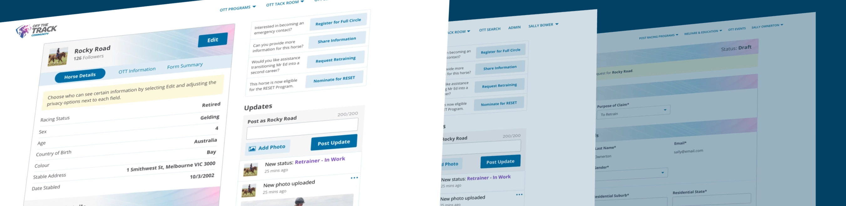
I led the design and development of Racing Victoria’s Off The Track Community portal, creating a central platform for horse owners, buyers, and fans. This project brought together essential resources for horse welfare, ownership, and education, helping streamline previously manual processes and promote responsible racehorse care post-retirement.
Racing Victoria
1 year
UI Design, UX Design
Develop a comprehensive platform for Racing Victoria that centralises their programs, simplifies horse ownership processes, and provides resources for horse welfare, while addressing the needs of multiple user groups including owners, trainers, and fans.
Racing Victoria’s Off The Track Community portal was designed to revolutionise how the entire lifecycle of racehorses is tracked and managed. The goal was to create a comprehensive platform that supports owners, trainers, and fans in accessing vital information, from racing careers to post-racing pathways and beyond.
This portal would serve as a hub for all things related to horse management, offering users a seamless experience to:
By integrating all aspects of horse management, this portal would simplify processes, promote responsible ownership, and foster a more engaged, informed community.
Given the extensive scope of the Off The Track Community portal, the project required several months of in-depth research and collaboration. We began by thoroughly understanding Racing Victoria’s goals and the needs of their diverse user base, from horse owners to trainers and fans.
Our team conducted comprehensive brainstorming and information-gathering sessions to map out the essential programs that would form the core of the portal. These programs included:
Once the structure and priorities were established, we moved into the design phase. This involved creating a series of wireframes that laid out the architecture and user flow of the portal. The initial wireframes served as a foundation for discussions and iterations with Racing Victoria, ensuring alignment at each stage of development.
The scale of the project required multiple rounds of revisions and refinements, transitioning from low-fidelity wireframes to fully interactive, high-fidelity designs. Each wireframe and high-fidelity design was built with flexibility in mind, to account for future updates and program expansions.
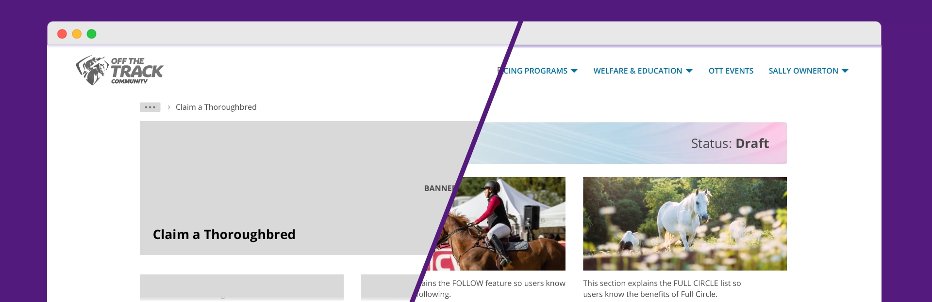
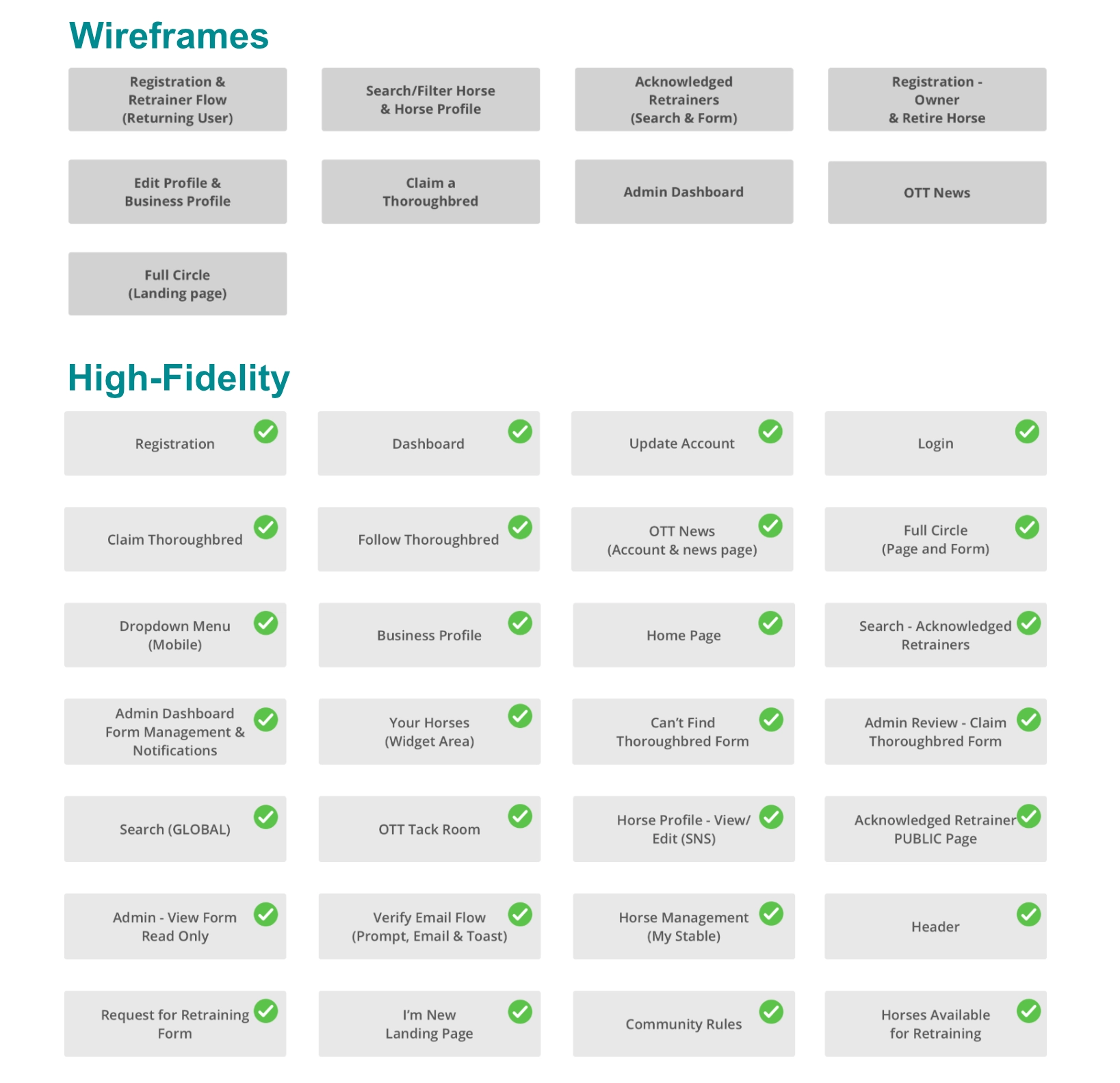
The design process began with creating wireframes to establish the foundational architecture and user flow of the Off The Track Community portal. These wireframes served as the blueprint for discussion and feedback sessions with Racing Victoria. Through several iterations, we refined the structure and interaction flows until we had a solid base to move forward.
After aligning on the wireframes, the next step was to develop high-fidelity designs that reflected the final user experience. We built reusable design components in Sketch/Figma, allowing for consistency and efficiency when transitioning to development handover.
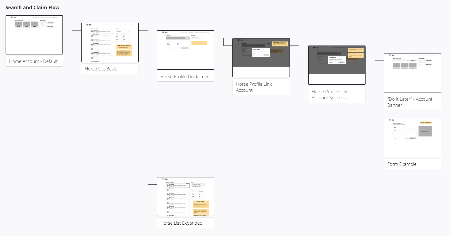
The high-fidelity designs were created with flexibility in mind, featuring modular elements that could easily adapt to future updates or new requirements. Key areas, such as the Claim Thoroughbred flow, evolved from simple wireframes into interactive, polished screens that maintained clarity and ease of use.
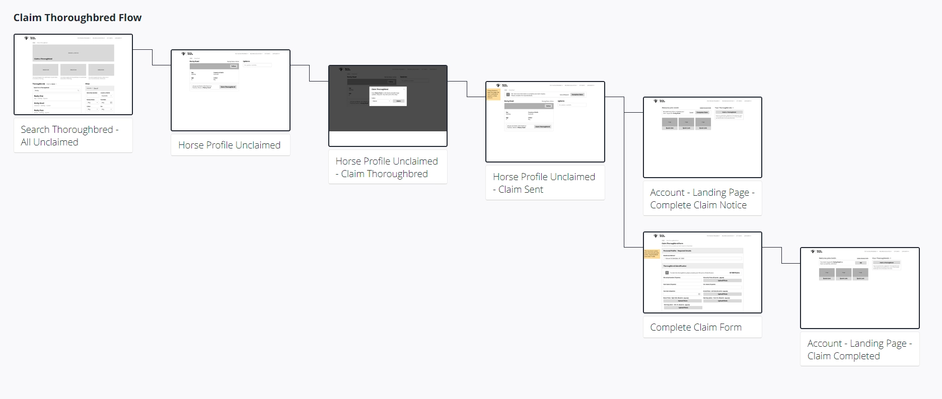
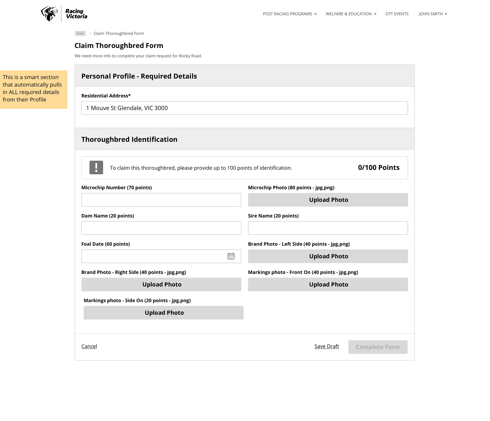
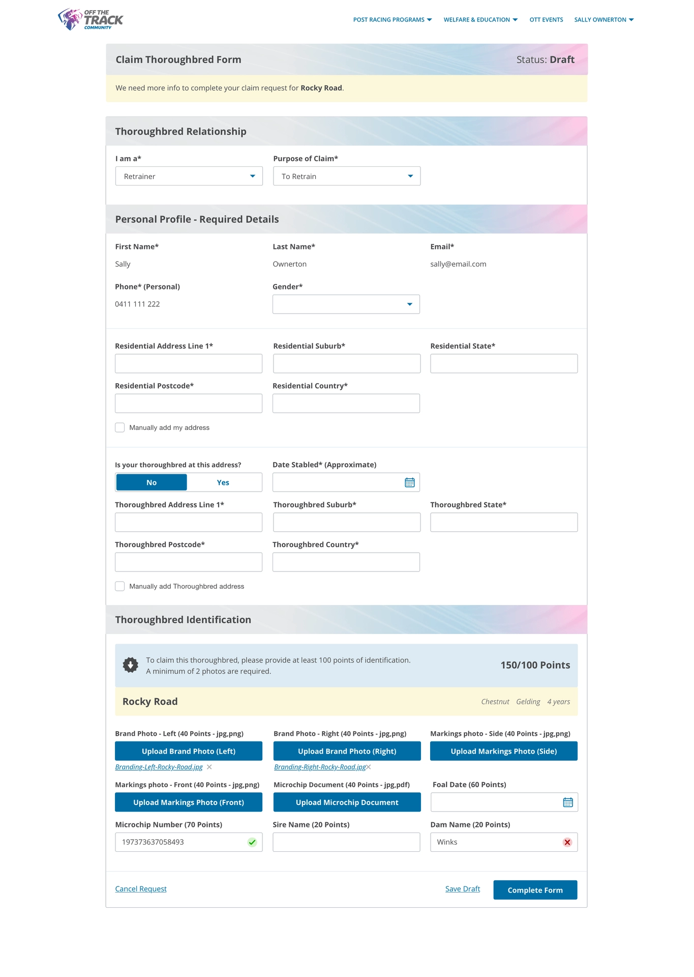
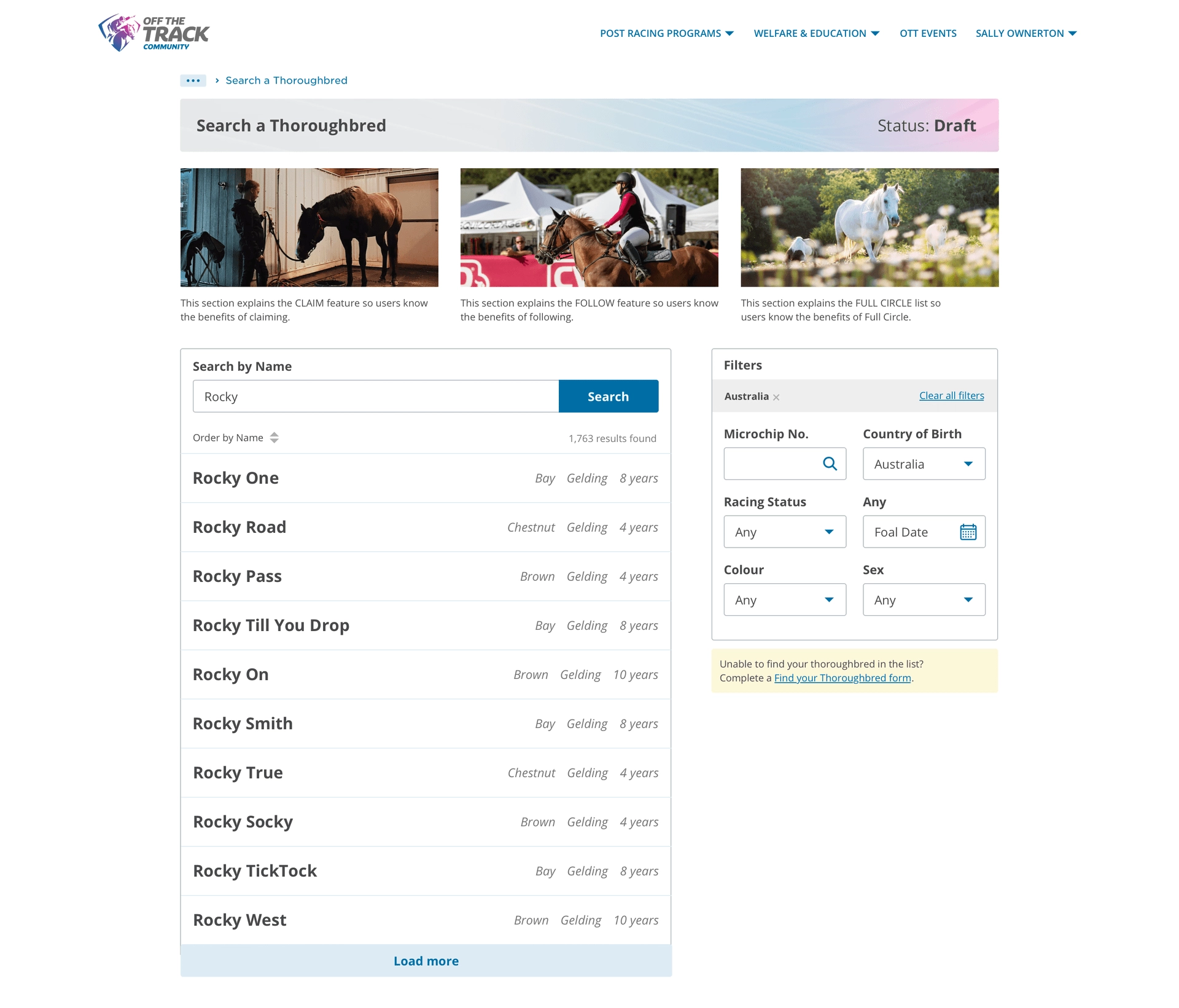
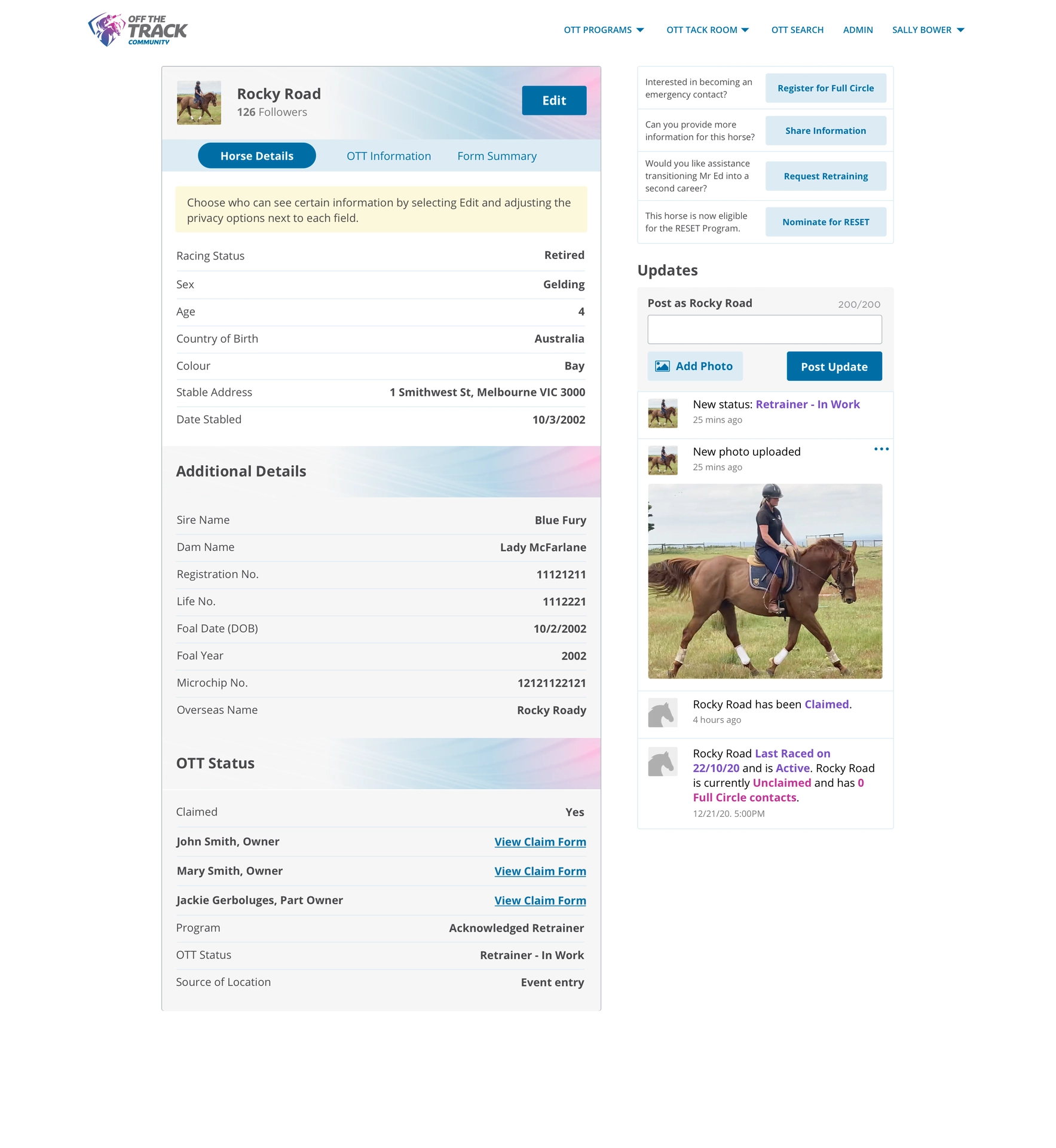
One of the major improvements was in simplifying forms and data entry. Previously managed via paper and email, the new portal digitised these processes, significantly reducing manual work for the Off The Track team. We designed forms to be flexible, allowing sections to be added or removed with ease while maintaining a user-friendly interface with clear labels, buttons, and guidance notes.
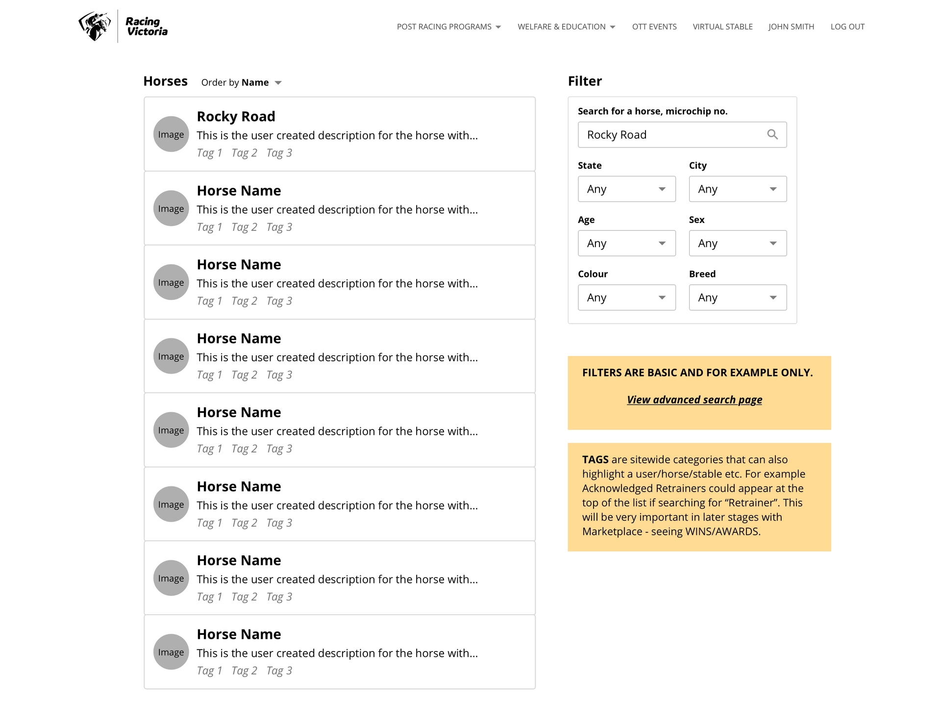
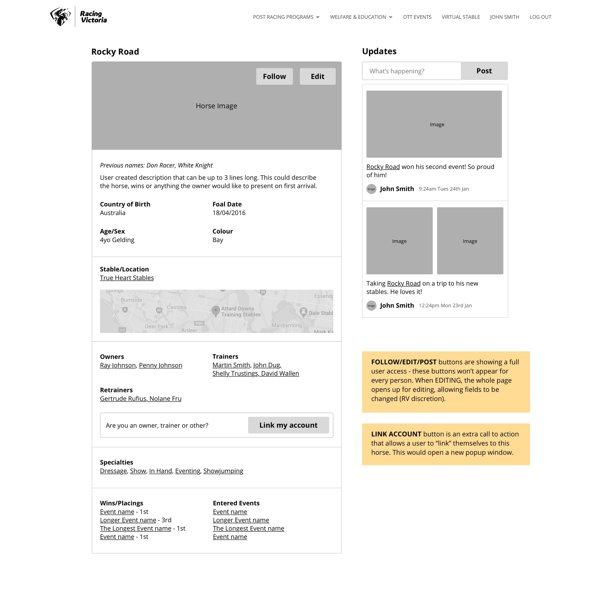
Another major feature was the Search and Claim flow for thoroughbred profiles. We designed a robust search system that could handle both 'unclaimed' and 'claimed' thoroughbreds, allowing users to quickly filter by tags like age, color, and status. This made the process of finding available horses or managing claimed horses simple and efficient.
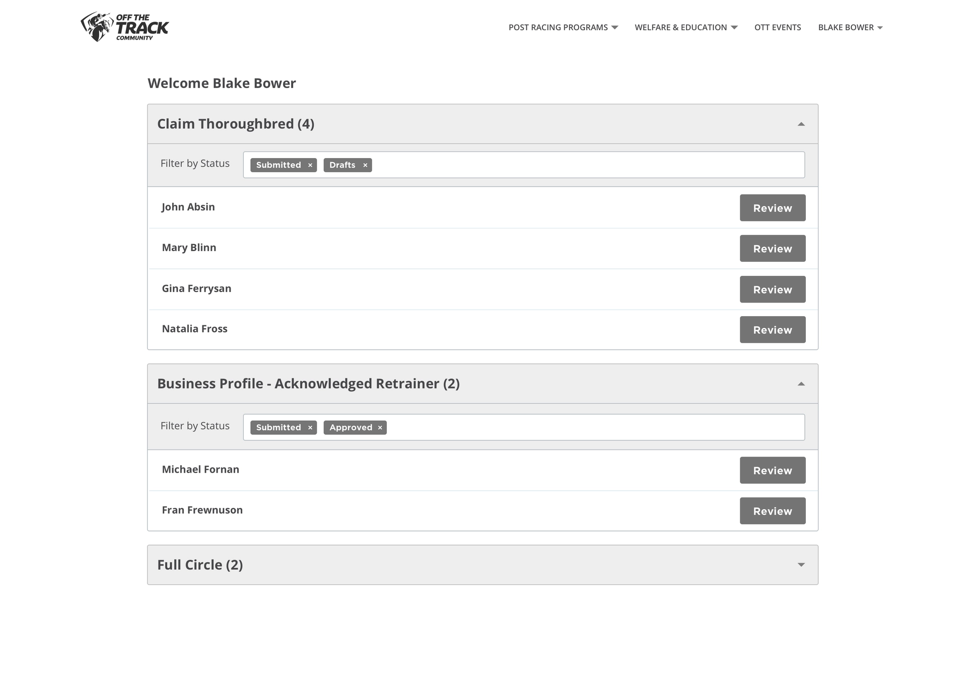
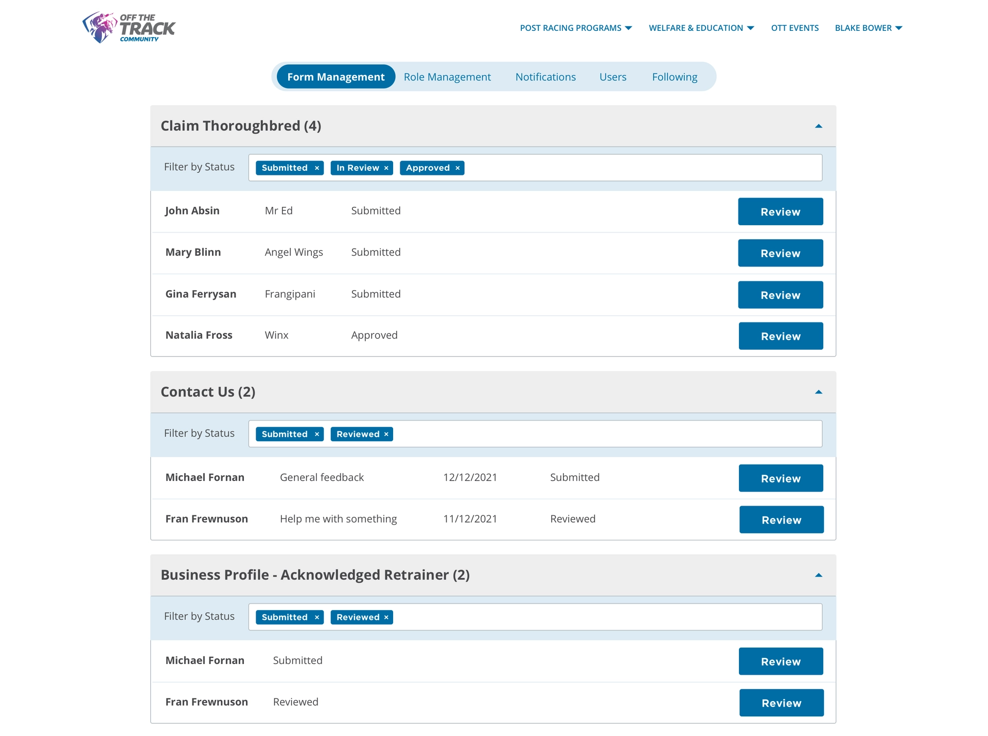
One of the key requirements was the creation of a dedicated admin dashboard. This feature transformed the way the team at Racing Victoria managed forms and submissions, significantly reducing the time spent on manual processes.
Previously, forms were submitted via paper or email, requiring manual uploads into a database; an inefficient process that consumed hours and hindered scalability. The new admin dashboard streamlined this by allowing admins to review, edit, and approve or deny forms directly within the system. With forms automatically sorted into sections, team members could easily track submissions, assign tasks, and provide timely feedback. Digital submission of Thoroughbred profiles enabled instant review, with admins able to request information or approve forms in just a few clicks, significantly speeding up workflows and improving the user experience while saving countless hours of manual work.
By reducing the friction between form submission and review, the portal enabled greater efficiency, allowing the team to focus additional attention on meaningful work related to horse welfare and program development.
After a year of rigorous design, development, and testing, Racing Victoria launched the inaugural version of the Off The Track Community portal to a select group of Acknowledged Retrainers. The feedback from this initial group was invaluable, particularly highlighting areas where complex form submissions required further streamlining. This insight allowed us to refine the platform ahead of its broader release.
The full launch to owners, retrainers, and staff marked a significant milestone for Racing Victoria. The portal's modular design ensured it could easily adapt to future changes, making it simple for the team to modify sections and layouts as needed. Within weeks of going live, the simplified form submissions and user-friendly interface delivered noticeable improvements in operational efficiency—saving countless hours previously spent on manual data entry.
Beyond operational benefits, the platform fostered stronger connections within the Off The Track community. Racing Victoria was able to provide better support, guidance, and education to users, while also showcasing the benefits of each program. This new level of engagement allowed the team to fulfill their mission more effectively, enhancing the overall experience for everyone involved and cementing the portal as a crucial tool for the future of horse lifecycle management.

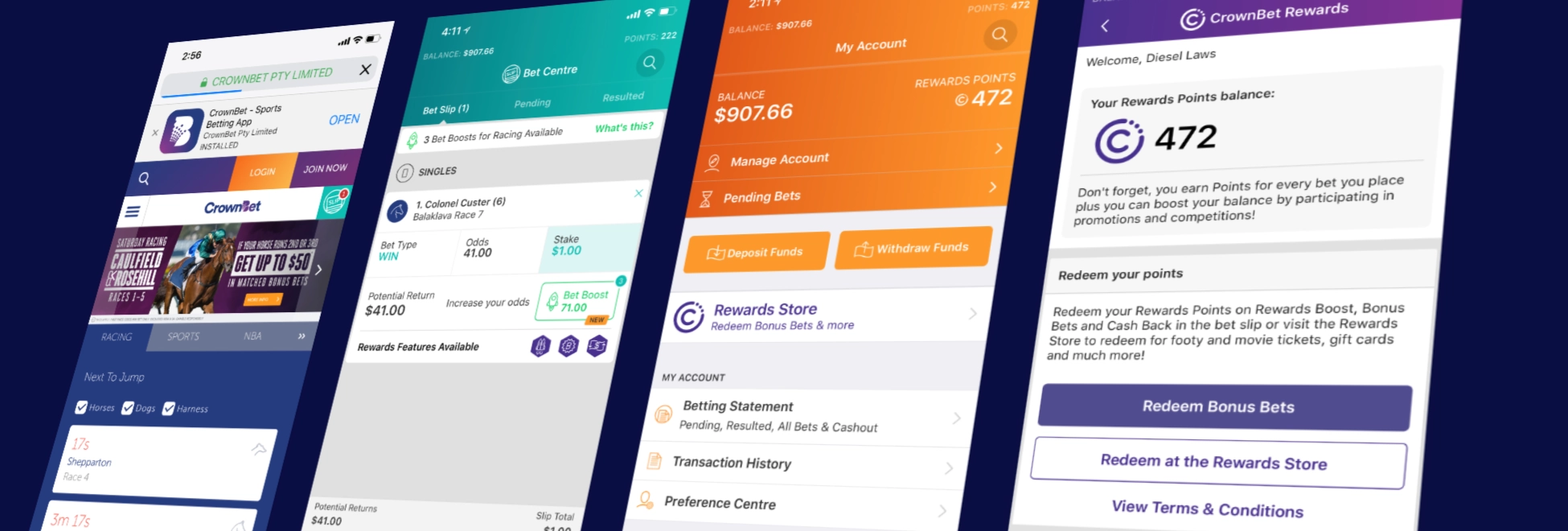
Over the course of a year, I played a pivotal role in improving CrownBet’s app experience, integrating William Hill's user base following a major acquisition, and delivering features to enhance user engagement. The focus was on creating a seamless experience in a highly regulated industry while guiding transitions during the rebrand to BetEasy.
CrownBet
1 year
UI Design, UX Design, App Development, Workshop Facilitation
Improve the core app experience for CrownBet users while ensuring seamless migration of William Hill customers post-acquisition. Additionally, lead the effort to uplift the app's UI/UX in a heavily regulated industry.
This project spanned several key areas; uplifting CrownBet’s core website/app experience and integrating William Hill's customer base. The highly regulated nature of betting apps added extra layers of complexity in terms of approvals and discussions, ensuring every feature and UI change was carefully considered.
My role involved deep collaboration across teams, including engineering, compliance, marketing, and product management, to deliver a modernised, user-friendly experience for a rapidly growing customer base.
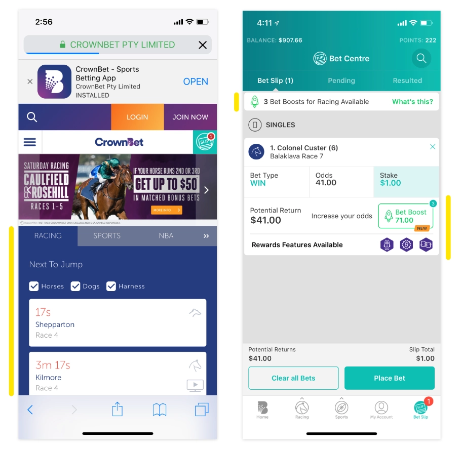
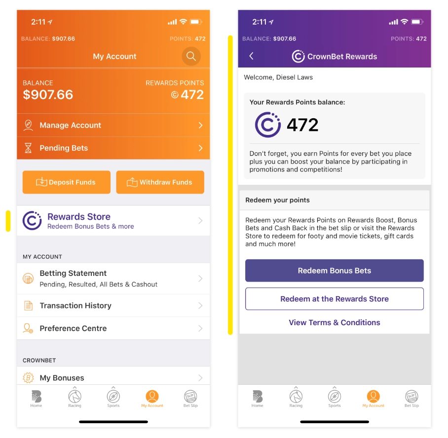
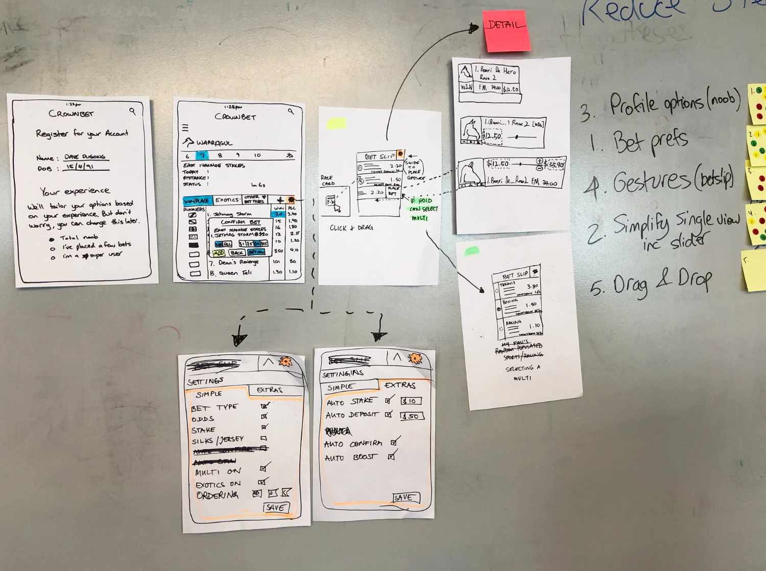
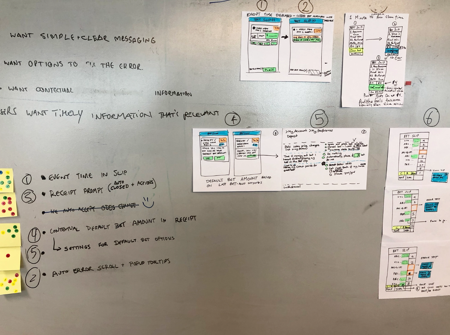
One of the core app areas I helped uplift early on was the BetSlip, a crucial part of the user experience. I added features that improved the display of bonus bets and highlighted the rewards store, which drove engagement and usage of these features. A lot of these features needed to be added before the migration to ensure continuity for the William Hill customers.
This enhancement (yellow highlights) directly contributed to better user engagement, offering an intuitive interface where users could easily access their bonuses and rewards.
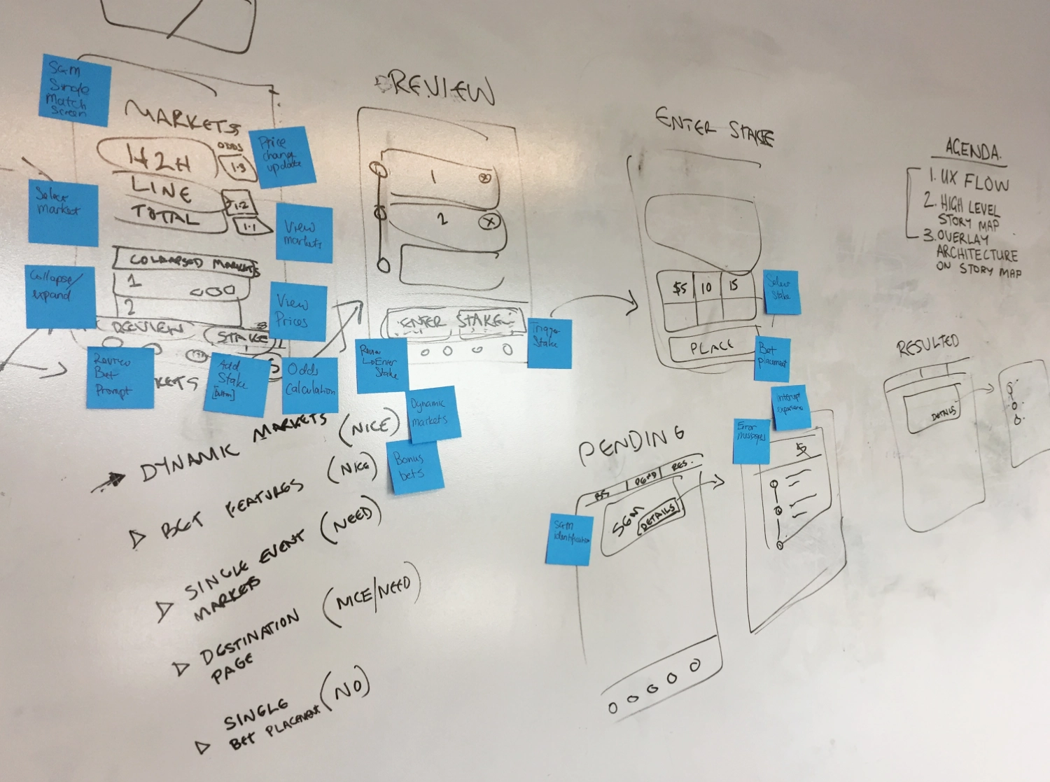
Throughout the project, I led high-energy workshops aimed at generating innovative app features to boost user engagement. By adapting Google’s Design Sprint methodology into 3-hour Feature Sprints (FeDS), we transformed brainstorming into a focused, fast-paced, and fun process. These sessions sparked key ideas that later enhanced the app, such as predictors, betting comparisons, and personalised segments for users based on their experience.
These workshops not only energised the team but directly led to actionable features that were quickly transformed into wireframes and successfully implemented in the app. This collaborative, fast-paced approach encouraged creativity while ensuring efficiency.
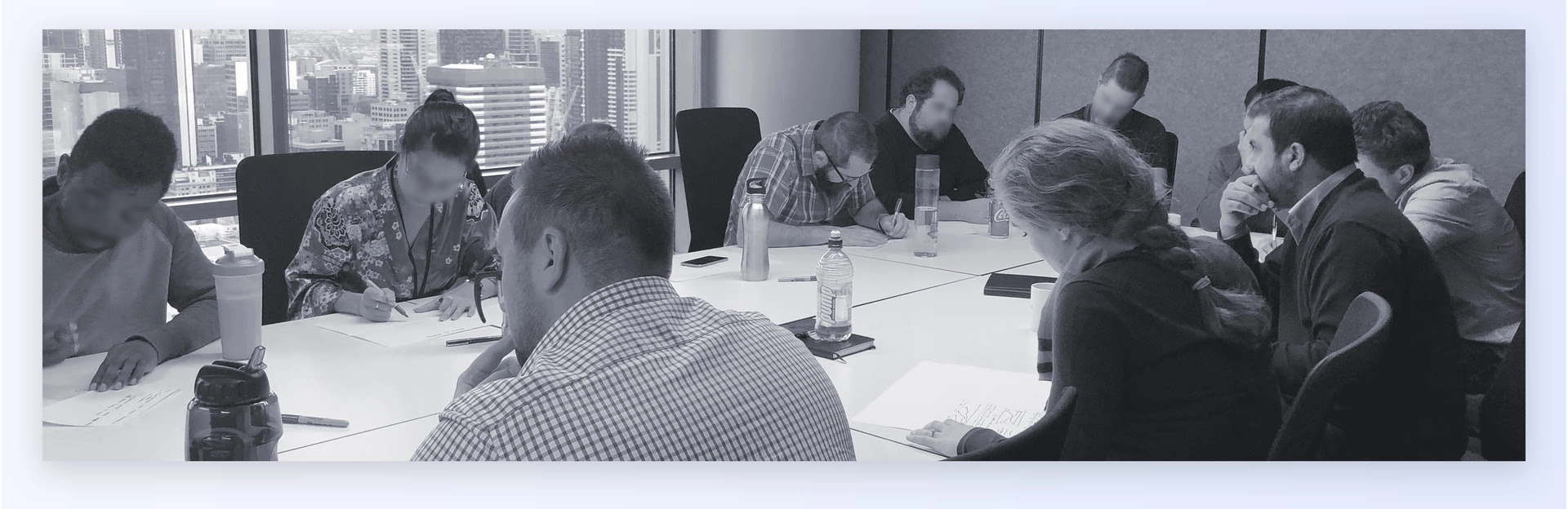
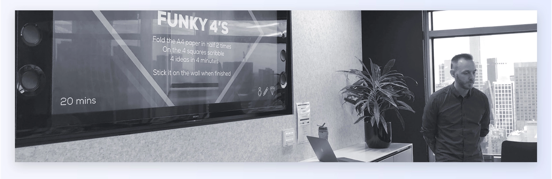
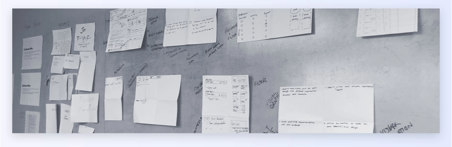
During the $300M acquisition of William Hill, our team assisted new customers in transitioning smoothly onto the CrownBet platform, with app and onboarding feaures aligned to their existing experience. This involved the migration of their data, account details, and providing clear communication on how features were renamed or modified within the new app. We also collaborated with our Sydney agency during this transition, to make sure all our wording and branding was aligned.
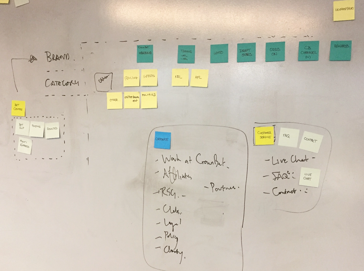
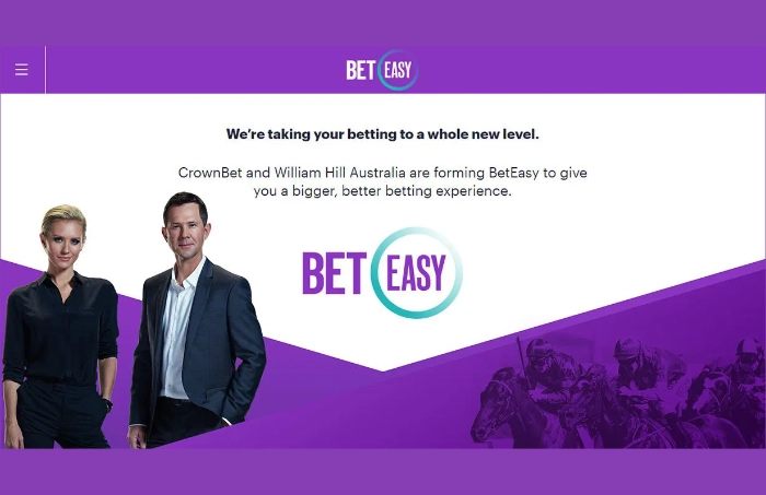
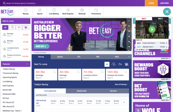
I was also a key player in the effort to modernise CrownBet’s homepage, providing a fresh, uplifting experience that aligned with the transition to BetEasy. This involved incorporating new branding elements and ensuring consistency across the platform to reflect the rebranded identity.
My work helped ensure a smooth transition during the rebranding phase, maintaining user trust while introducing a new visual identity and experience.
The merger between CrownBet and William Hill was executed smoothly, with nearly all William Hill users successfully transitioning to our platform without major issues. The seamless migration of user data, accounts, and preferences ensured minimal disruption, maintaining trust and satisfaction among the newly acquired user base.
Post-merger, we expanded and enhanced the app's core features, particularly around the BetSlip, personalised betting experiences, and user rewards. These improvements increased engagement and usage across both the app and the website.
Our focus then shifted to facilitating the complete rebrand from CrownBet to BetEasy. This transformation involved updating the platform’s design, refining the user interface, and ensuring a consistent brand experience across all touchpoints. The rebrand was highly successful, maintaining user retention while introducing a fresh, modern identity to the market.

Our team were tasked with uplifting the MyPost Dashboard; a platform designed to simplify how customers track, manage, and interact with the MyPost services. Our goal was to create a more intuitive onboarding experience, integrate visual styles from marketing, and make it accessible for all users (from tech-savvy to those less familiar with digital platforms).
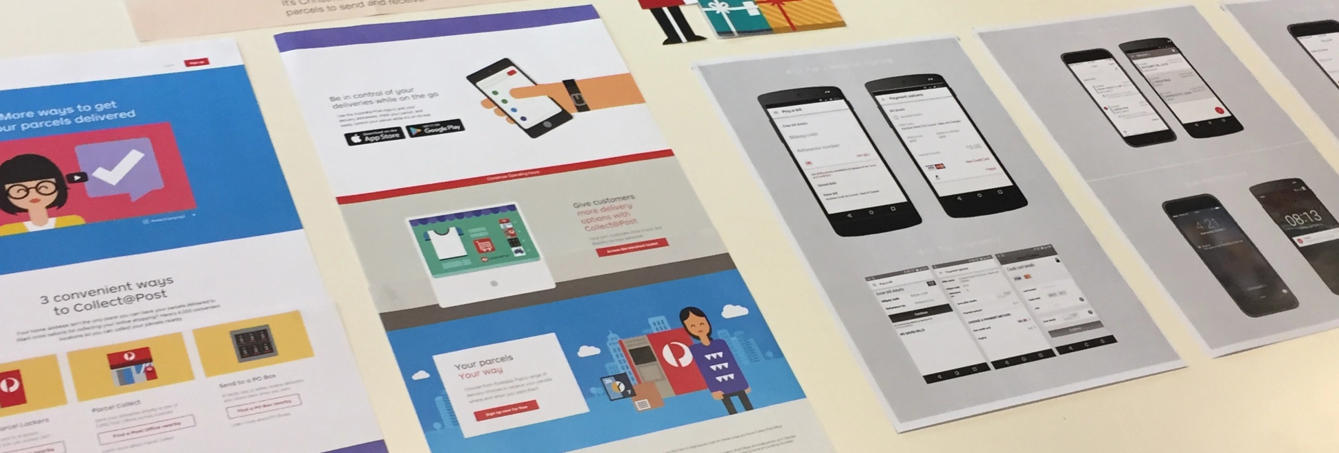
Australia Post
6 months
UX Research, UI Design, Team Collaboration, Stakeholder Engagement, Workshop Facilitation
Uplift the MyPost Dashboard and onboarding experience to create a more user-friendly, visually appealing interface that would be easy to navigate for all types of users, while incorporating AusPost's marketing visual style and ensuring functionality across various devices.
Our project began with a series of kickoff workshops with key stakeholders and internal teams to define the primary goals for the MyPost Dashboard redesign. The initial challenge was to create a flow that was easy to understand, visually cohesive, and guided users through core functions like parcel tracking and service management.
We focused on two primary goals:
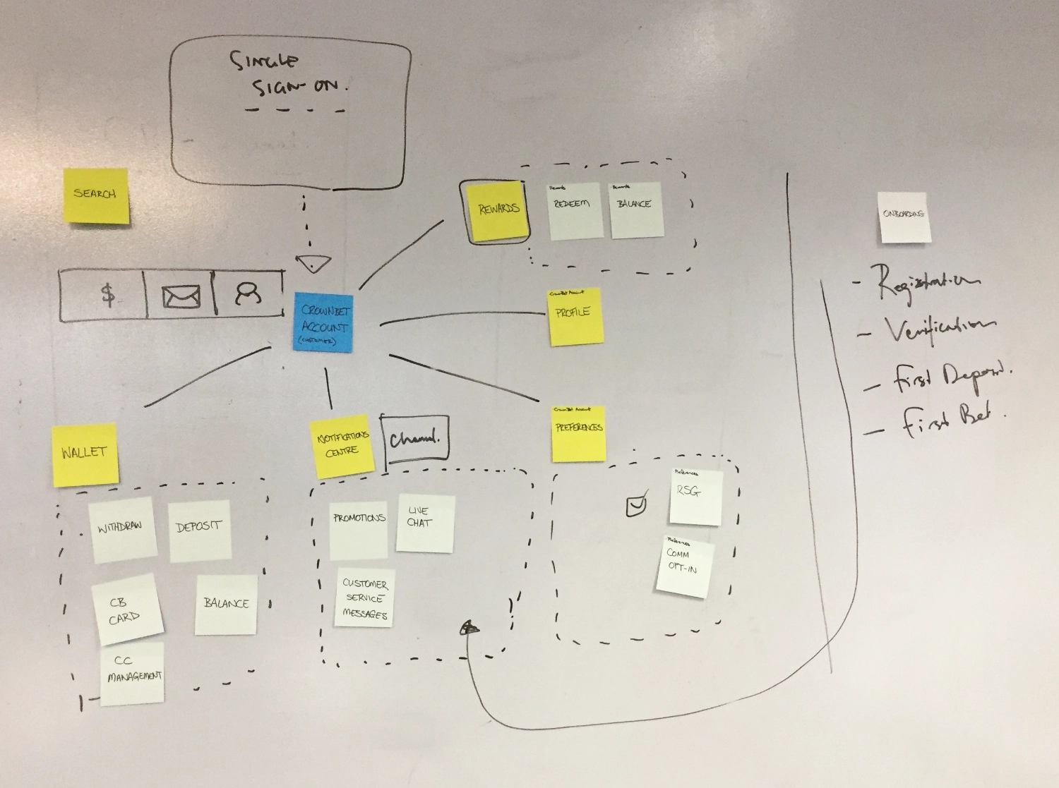
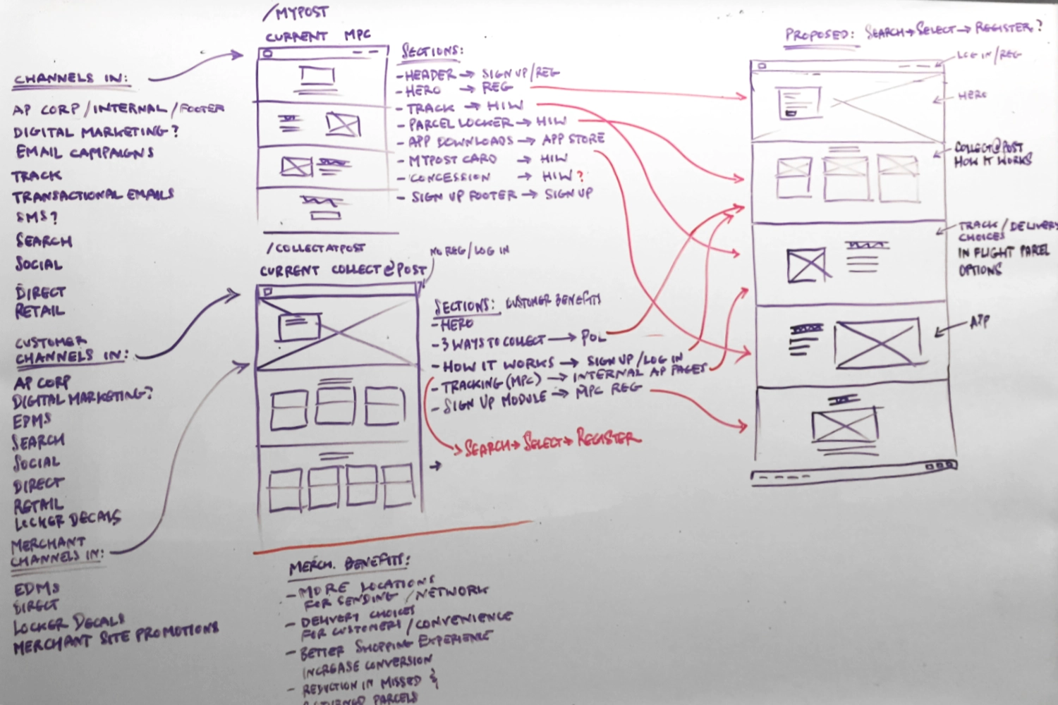
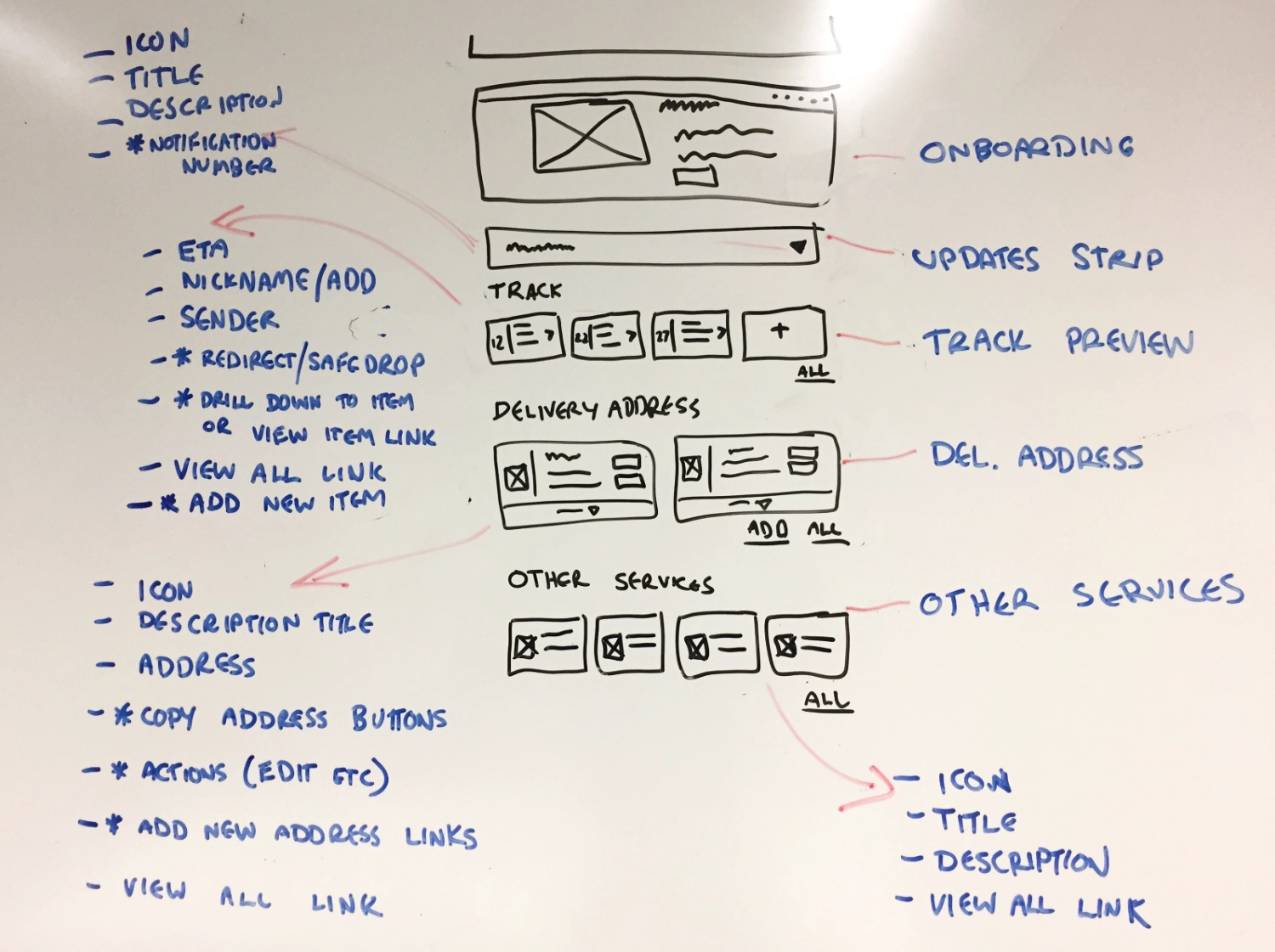
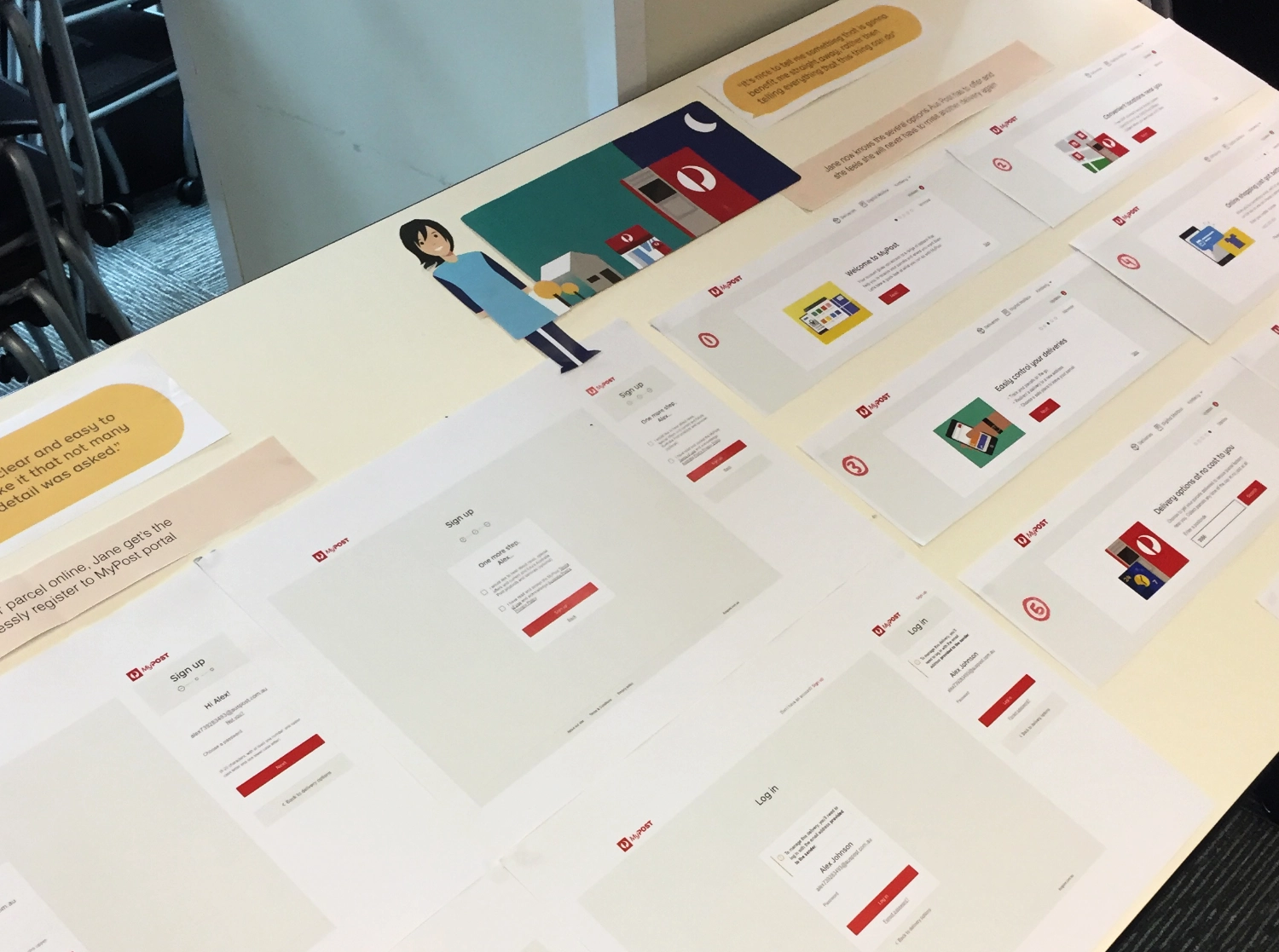
We started by gathering insights from the existing platform, identifying pain points, and mapping out key interactions. During this phase, our team and I captured various elements of the current website; creating wireframes on a whiteboard to help us visualise how to bring these elements together in a cohesive flow.
The wireframes allowed us to take a step back and analyse how to structure the information and functionality in a way that was both user-friendly and in line with the new visual guidelines.
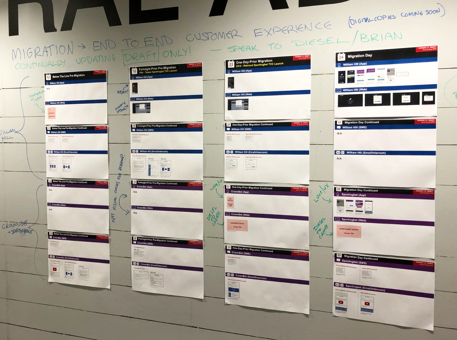
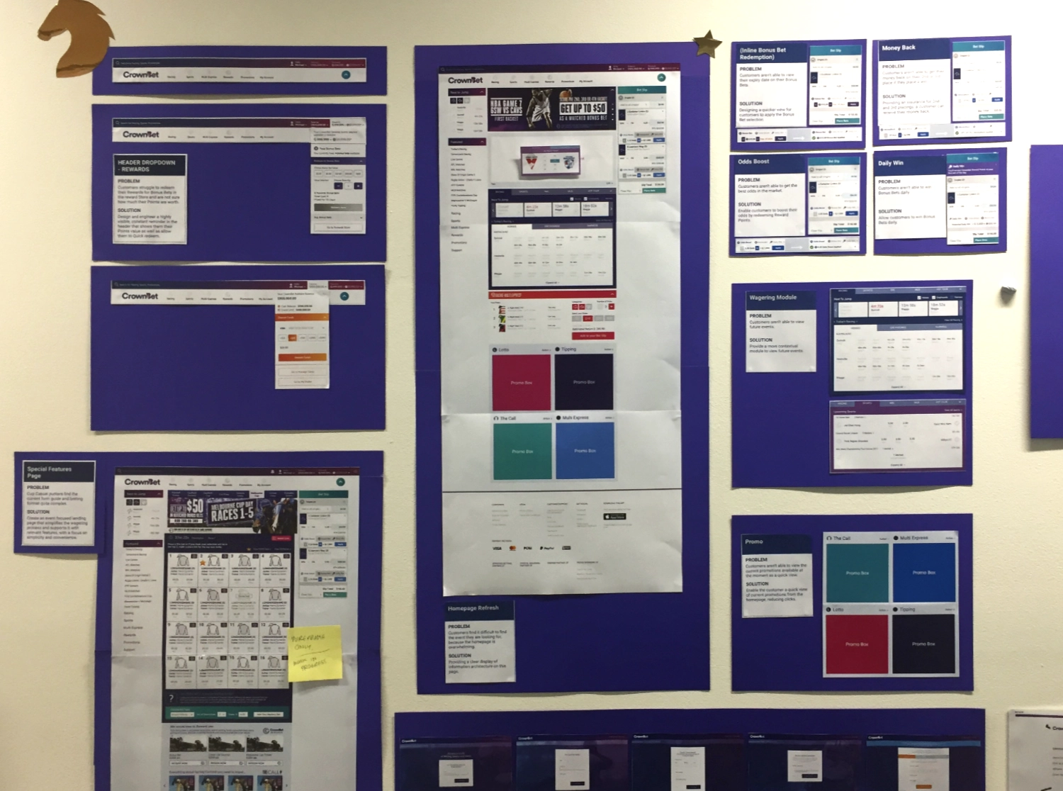
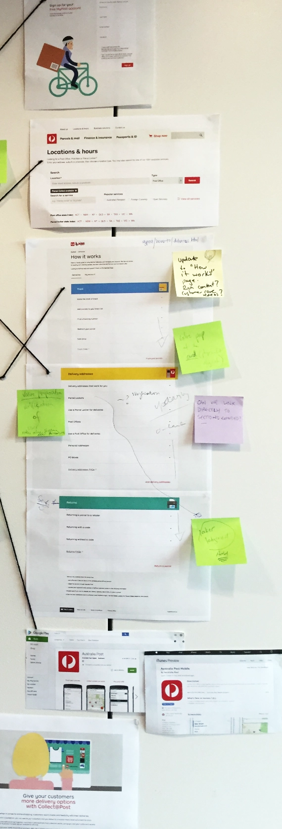
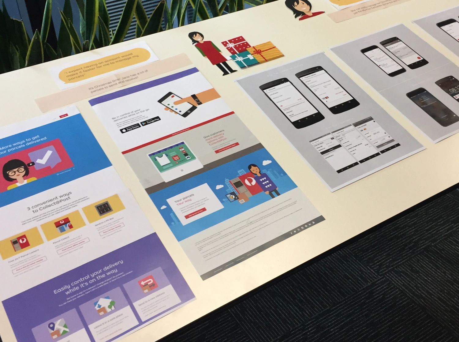
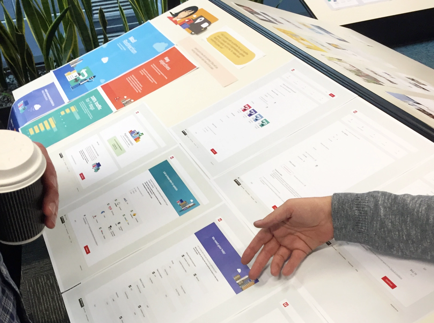
Next, we printed out all the existing parts of the website and stacked them vertically in the flow we had decided upon. This exercise highlighted several key issues: inconsistent design patterns, unclear hierarchies, and scattered explanations. Not to mention that each one of these sections were in many areas across the entire platform - so pulling them all together was crucial.
By seeing all of the current pages and sections laid out together, we gained a clearer understanding of the redundancies and confusion that users were likely facing. This reinforced the need for a thorough overhaul; not just a visual refresh, but a reimagining of the structure and functionality of the dashboard.
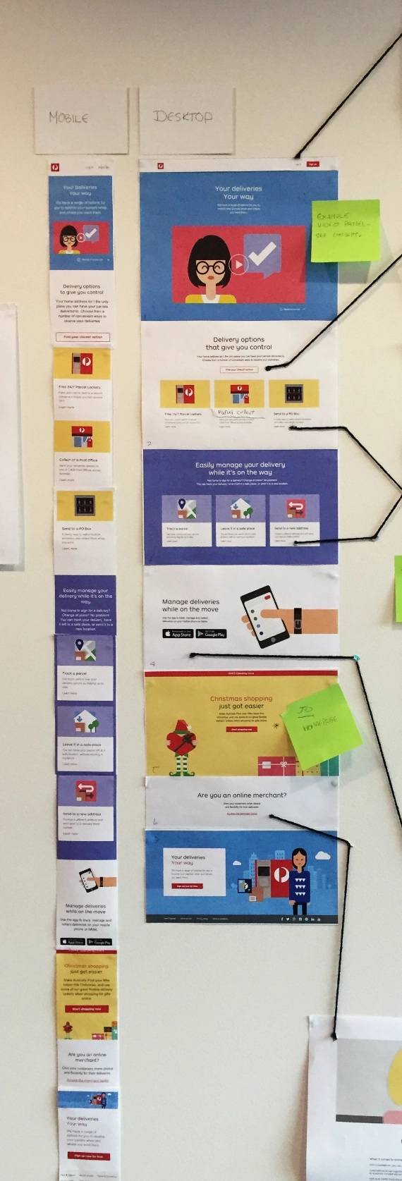
With a solid understanding of the current state, we began the process of redesigning the MyPost Dashboard from the ground up. Over time we designed a refreshed vertical flow that introduced the brand’s updated visual language, using a modern, card-based layout, strong color palettes, and large imagery/icons to guide users through the platform more intuitively. We connected this to the discussed flow presented on the wall to make sure it aligned.
Our goal was not only to uplift the design but also to improve the overall storytelling of the user journey. Each section was carefully restructured to flow logically, with clear entry points for tracking parcels, managing deliveries, and accessing additional services. We also ensured the entire flow adhered to accessibility standards to cater to a wide range of users.
Understanding the users' needs was key to this uplift. We conducted several UX research and testing sessions, gathering insights through stakeholder interviews, user surveys, and A/B testing. One of our primary goals was to cater to a wide range of users, from those comfortable with technology to those who may struggle with it.
We invited various users of the platform in for some in-person wireframe testing, making sure the simplified flow had enough touchpoints and education that they could understand the service.
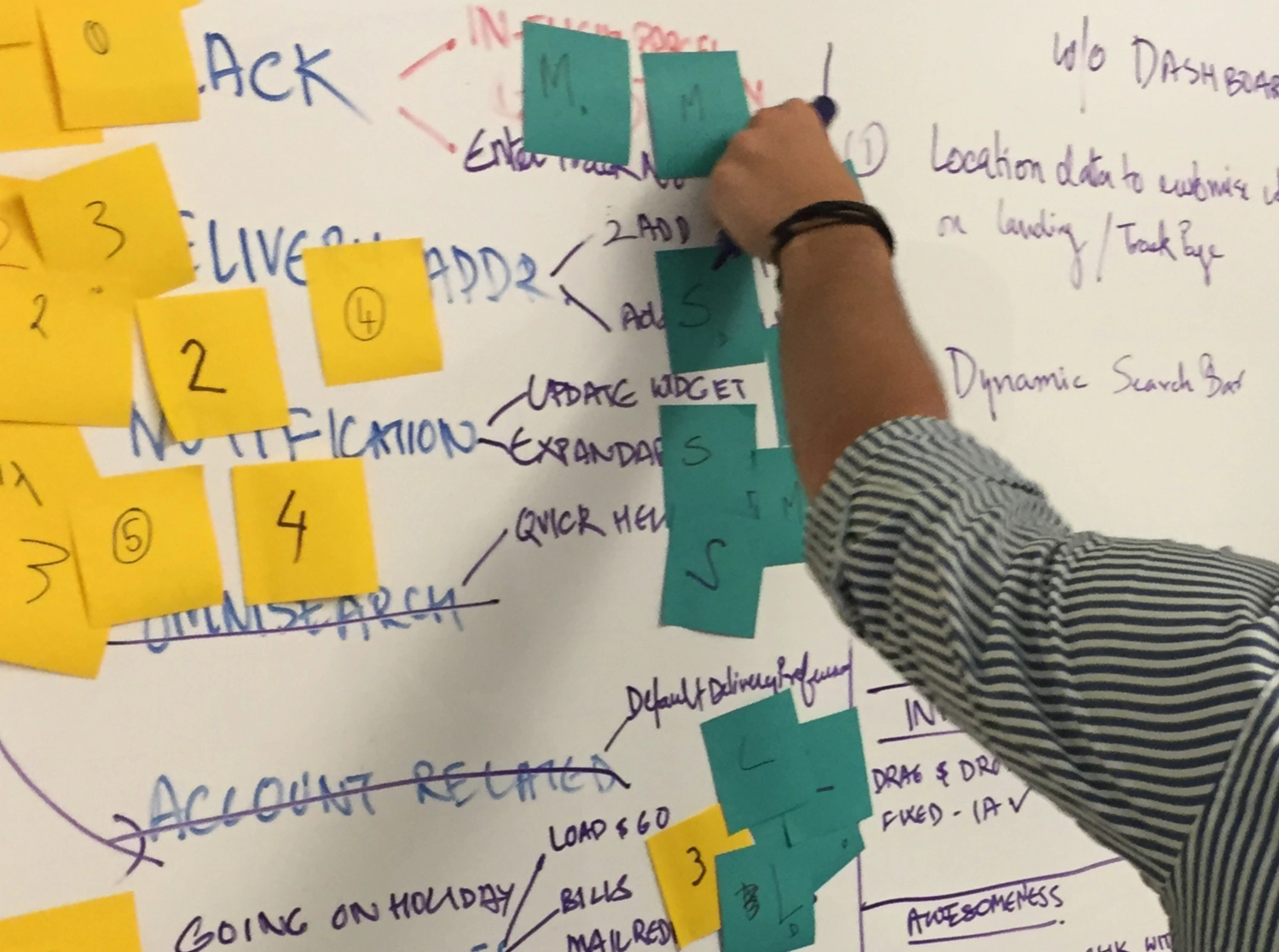
Carrying on the feedback and decisions from the dashboard, we shifted our focus to uplifting the internal sections of the platform. This involved restructuring the layout and prioritising features based on user interest and overall usability. To achieve this, we conducted a collaborative session where the team used a "t-shirt sizing" method to assess and rank features. We also used post-it note weighting exercises to determine which elements should be emphasised based on their importance and user value.
We worked through this exercise to conceptualise the updated internal sections, ensuring that every feature was thoughtfully placed according to its relevance and usage. This allowed us to create a more intuitive and accessible interface for managing internal operations and services.
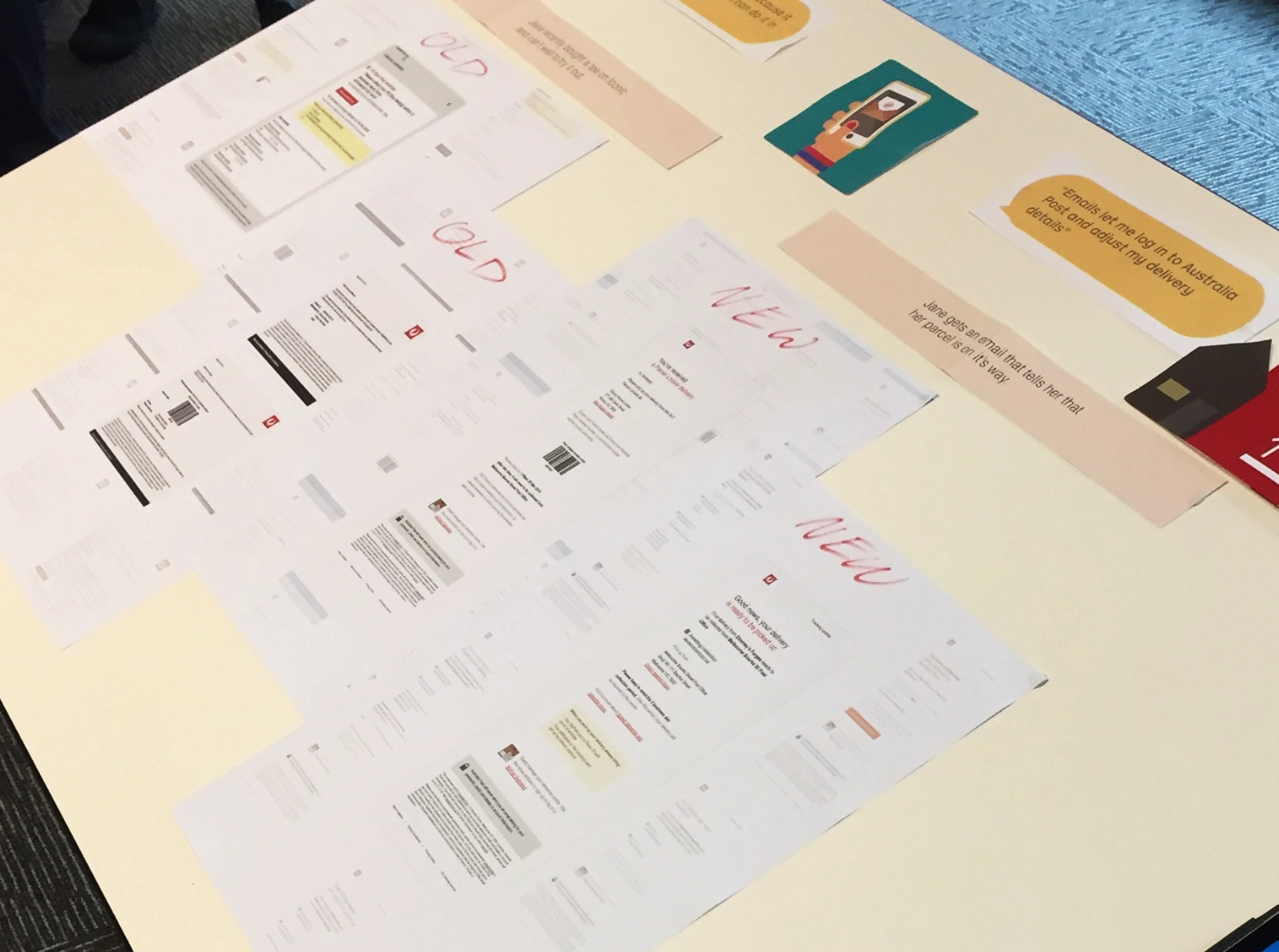
Once the internal sections were finalised, we organised an internal demo day to present our work to stakeholders, product owners, and other teams within the company. The demo day was a major milestone for the project, as it allowed us to showcase the before-and-after transformations of the MyPost Dashboard, along with the new flows and design updates.
The presentations were printed out and laid across desks in large paper flows, comparing the old designs with the new. We walked stakeholders through each flow, highlighting key improvements in navigation, user education, and visual consistency.
The presentation was very well received, with stakeholders praising the clarity of the new design and how well our work integrated with the overall visual and functional uplift of other internal teams. Our collaboration across teams ensured that the platform felt cohesive and user-friendly, reflecting Australia Post’s brand and service goals.
Over the next few months different pieces of the uplifted designs rolled out to users. Throughout the roll out we had great feedback, and many users praising the simpler explanation of all the service offerings.

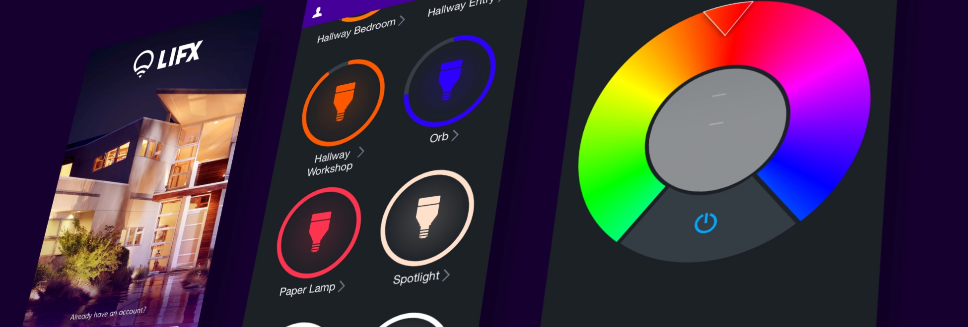
Over the course of a year, I led the design effort to uplift the LIFX app, create new packaging for their smart bulbs, and develop marketing materials. The project aimed to refresh the user interface, improve the product’s visibility on store shelves, and provide clear, engaging marketing support.
LIFX
1 year
UI Design, UX Design, Packaging Design, Print Marketing
Redesign the LIFX app to improve usability, create cohesive packaging for three smart bulb products, and design marketing materials to support sales and customer understanding of the product’s features.
The LIFX project involved three core areas: redesigning the app, updating the packaging for their lightbulbs, and creating marketing materials to educate and inspire customers. I collaborated closely with the product, marketing, and engineering teams to ensure consistency and quality across these touchpoints.
Each part of the project had its own unique challenges. The app redesign required modernising an interface that hadn’t changed in years, while keeping existing features familiar to users. The packaging needed to stand out in a crowded market of traditional and smart lighting solutions. Lastly, the marketing materials had to effectively communicate the advantages of LIFX’s smart bulbs, both to customers and sales staff.
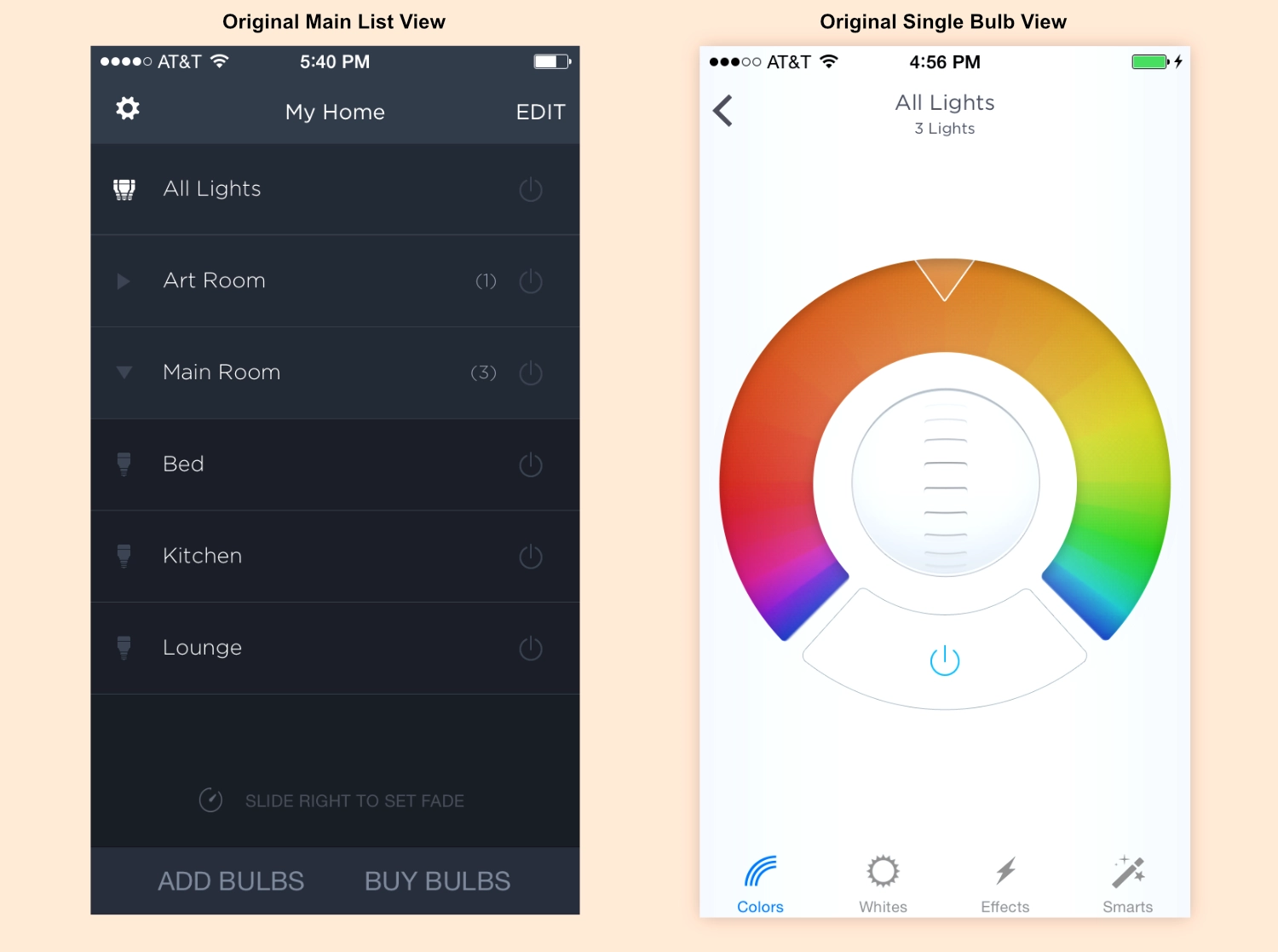
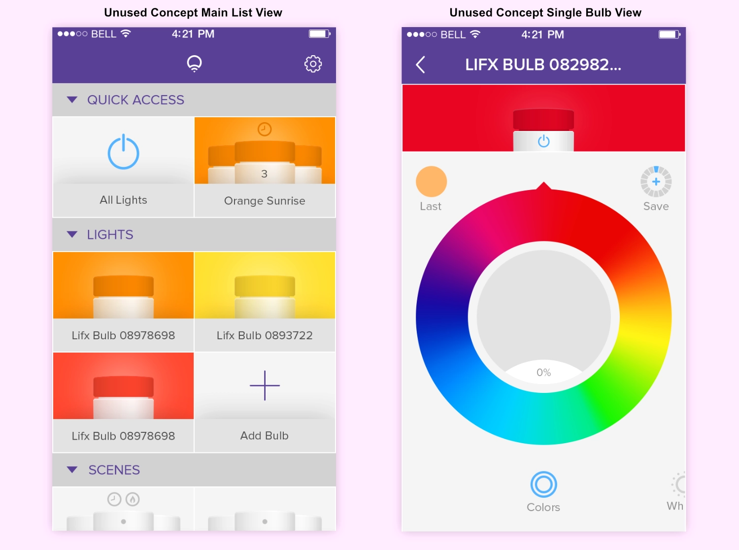
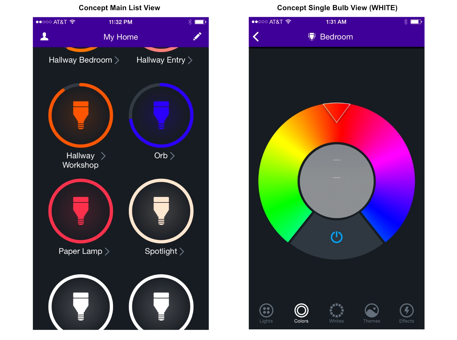
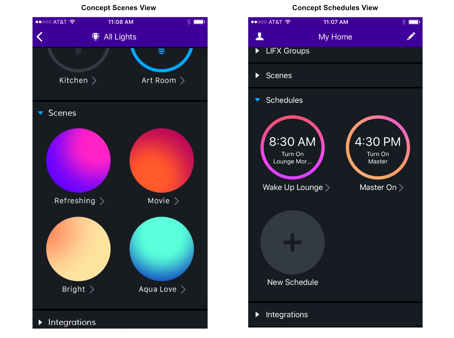
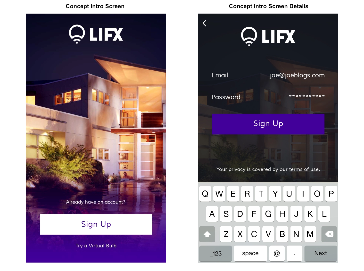
As the app had remained largely unchanged for over two years, with several features buried deep within the interface, the goal was to bring these features (namely Scenes and Schedules) to the forefront while keeping the app intuitive and easy to use for existing customers.
By opting to work directly with high-fidelity designs, I was able to bring LIFX’s brand colors and style into the process from the very beginning. This approach helped the marketing and product teams visualise the final experience early on, accelerating feedback and ensuring strong alignment from the outset.
With these improvements, the app maintained its core functionality but was significantly more user-friendly and visually appealing, reflecting the modern capabilities of LIFX smart bulbs.
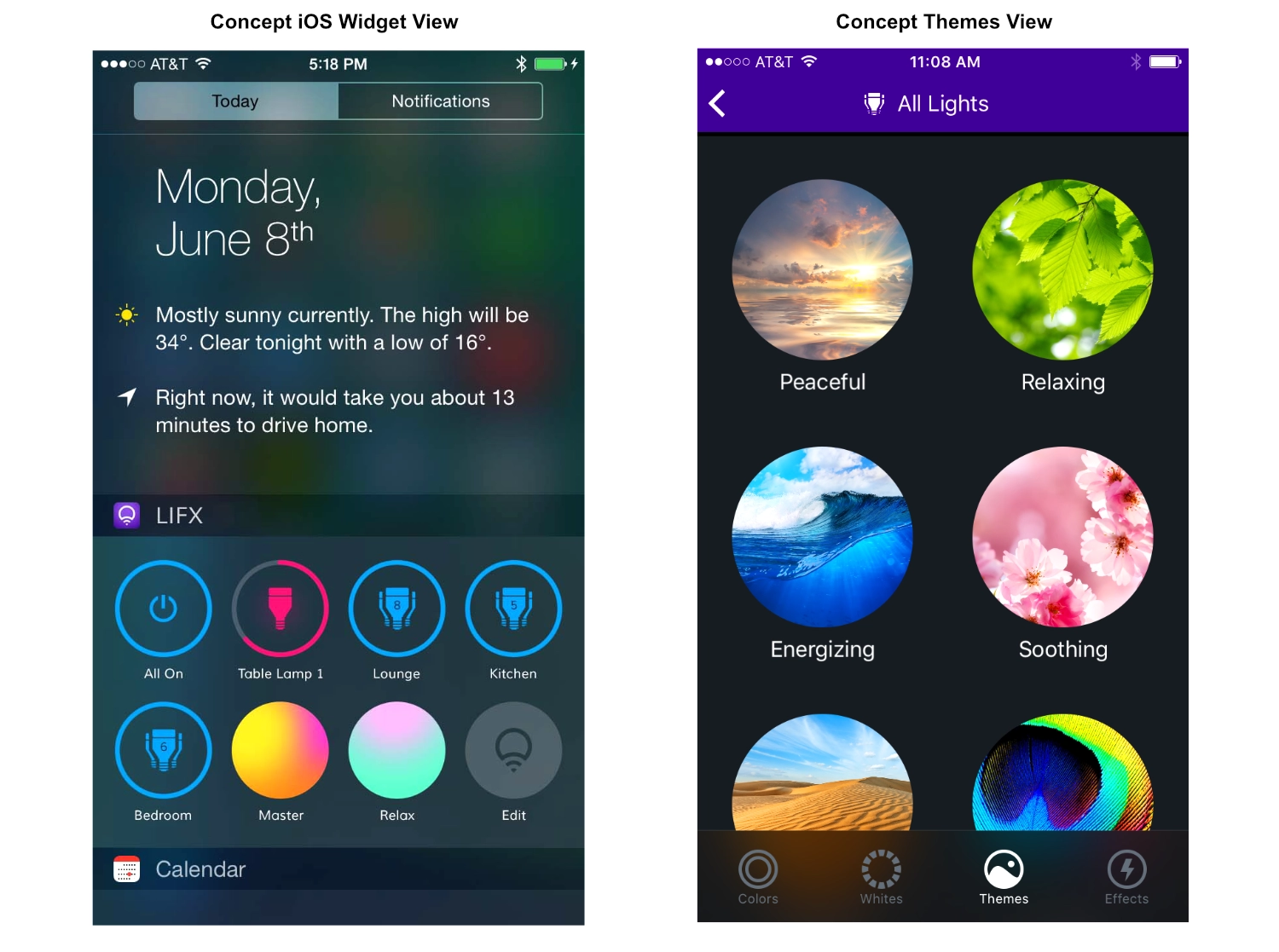
When it came to the packaging, we wanted to break away from the standard approach of product photography on a flat color background. The challenge was to create a design that reflected the innovation behind LIFX’s smart bulbs while also standing out on store shelves.
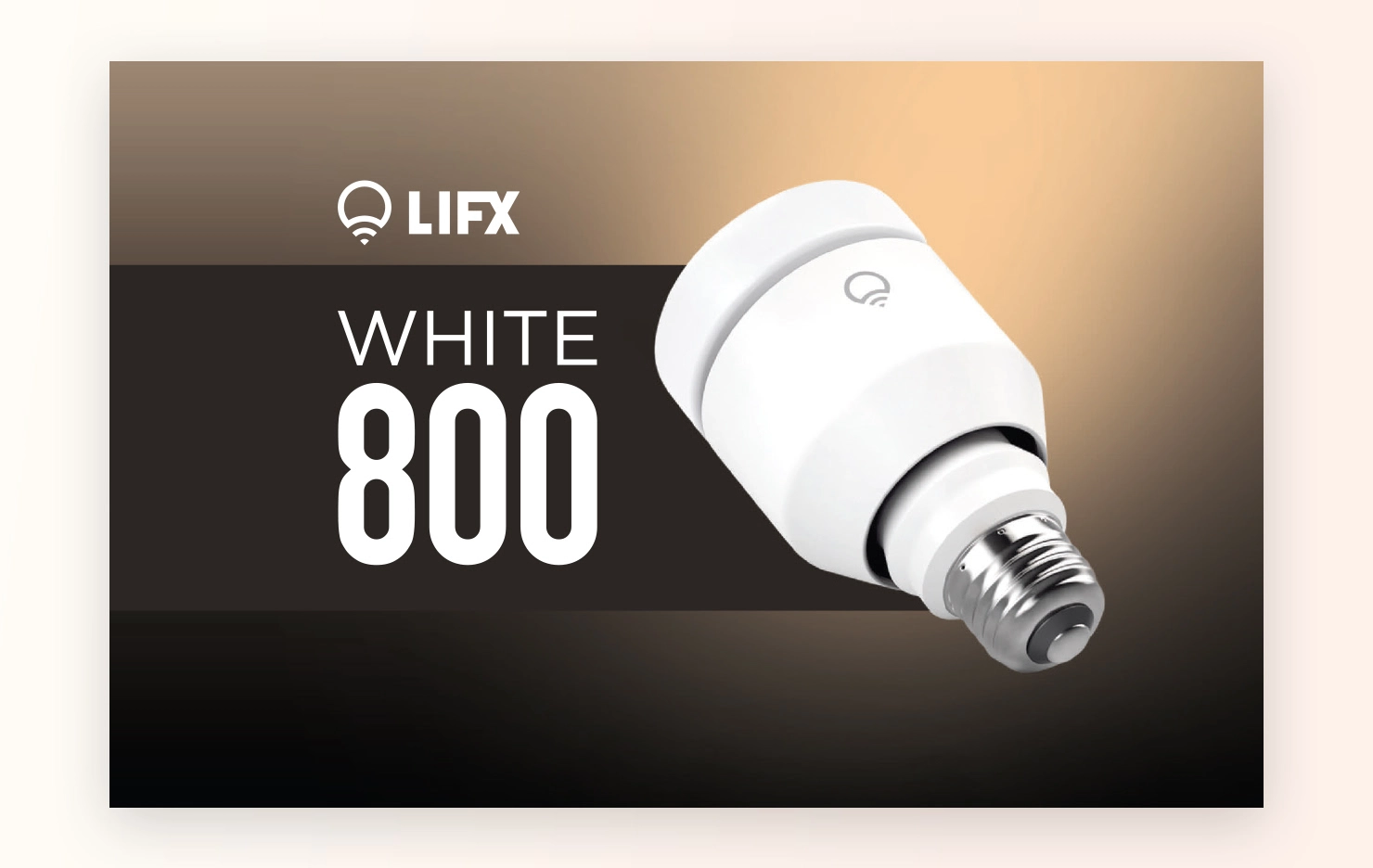
I led the process for the packaging of the the White 800 and the Color 1000 smart bulbs - The Color 1000 being the successor to the LIFX Original. I experimented with various design concepts, aiming for clean, modern aesthetics that aligned with the LIFX brand.
The White 800 packaging, for example, focused on simplicity and functionality, using a predominantly white and cream backgrounds with minimal text. For the Color 900 and 1000, the packaging emphasised vibrant colors and bold typography to highlight the bulb’s versatility.
After the development on the White 800 and the Color 1000, I expanded to the BR30 range of White 900 and Color 1000.
I gathered feedback from both customers, various stores and internal teams throughout the process, leading to several iterations. The final packaging was designed not only to catch the eye but also to clearly communicate the key features of each product.
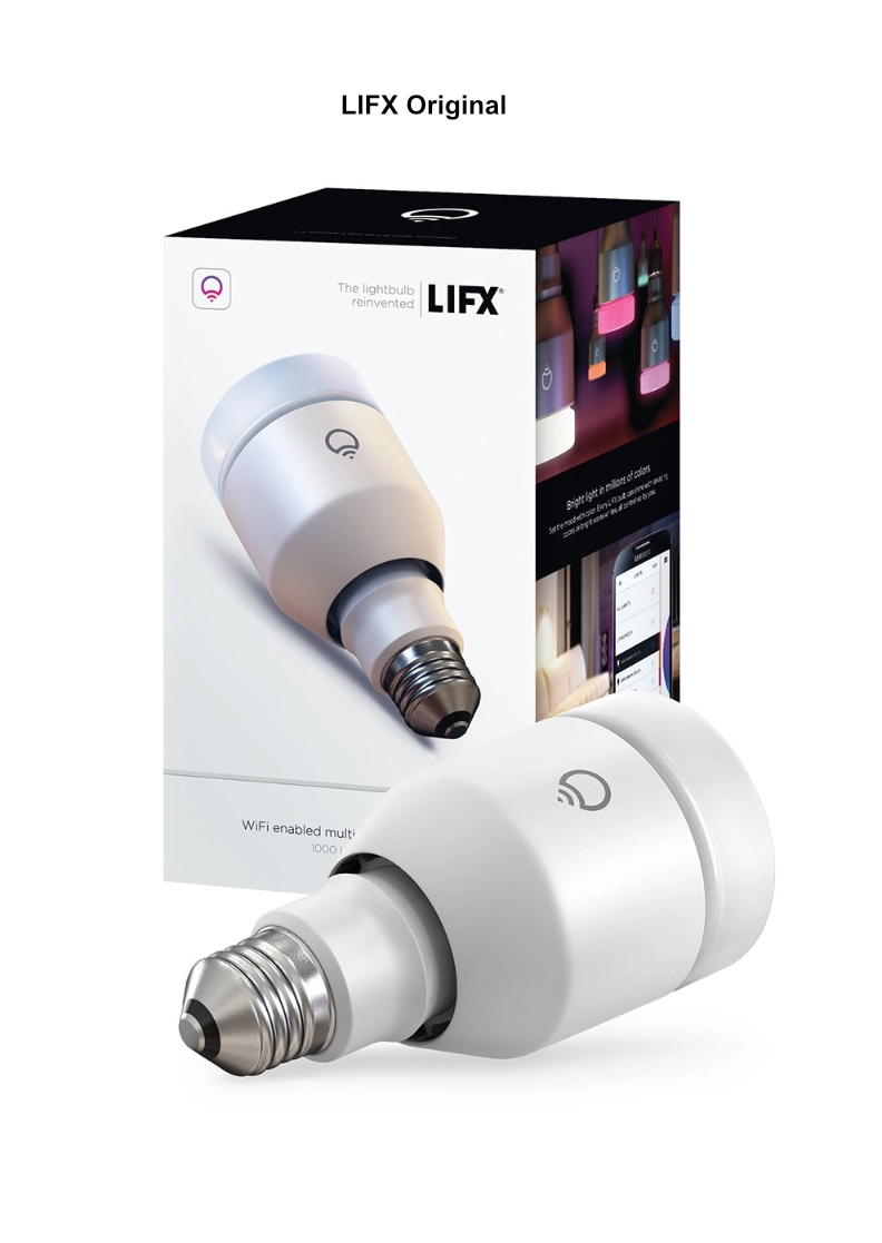
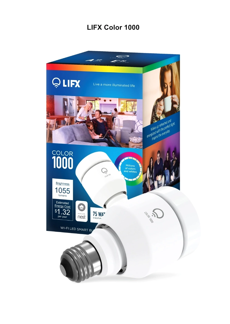
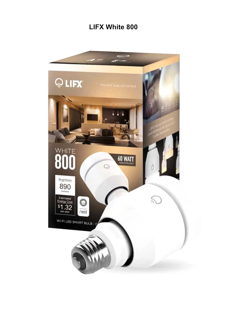
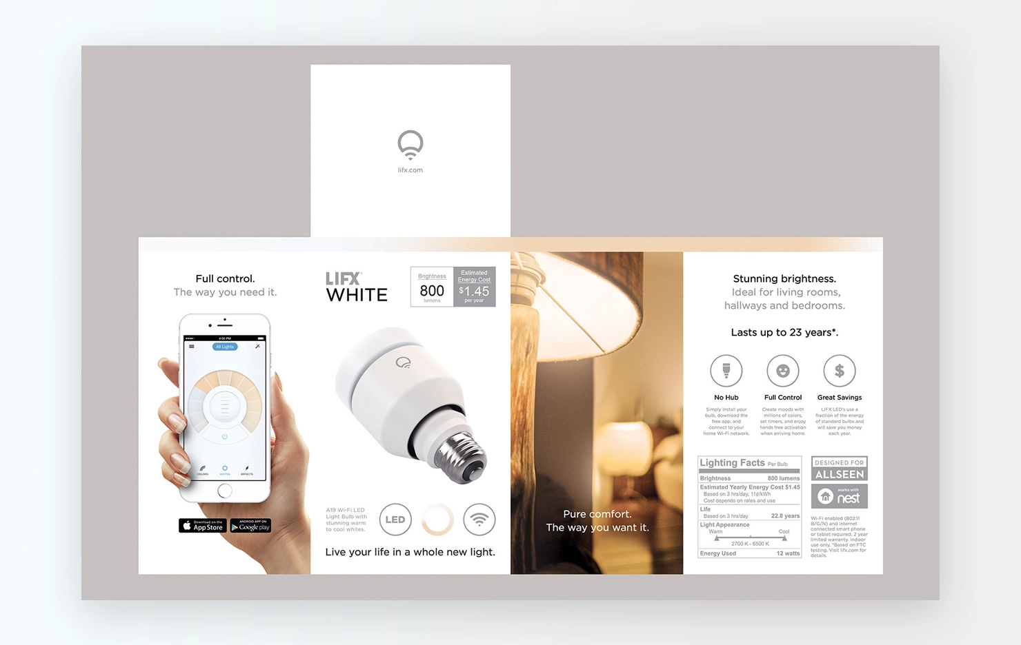
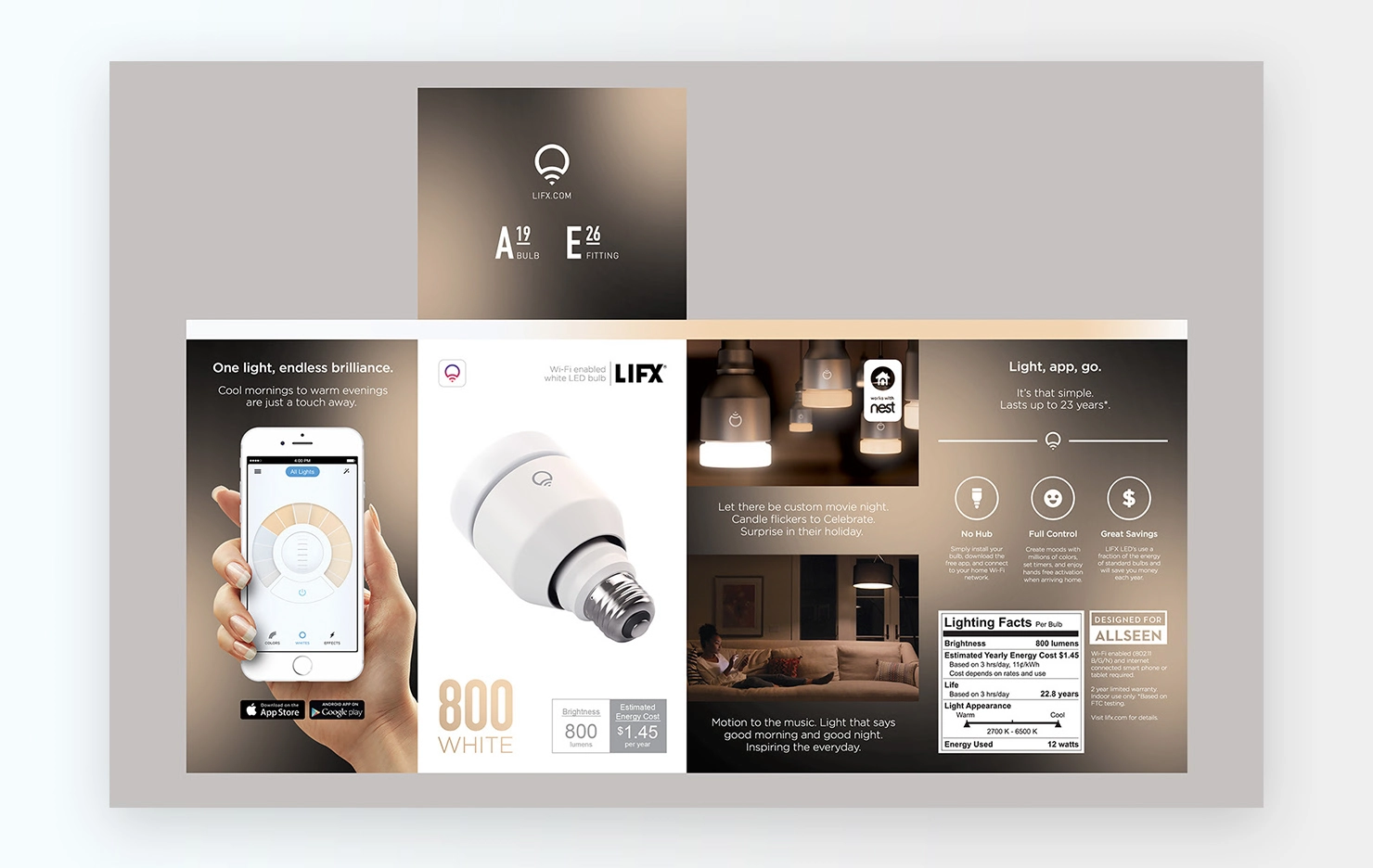
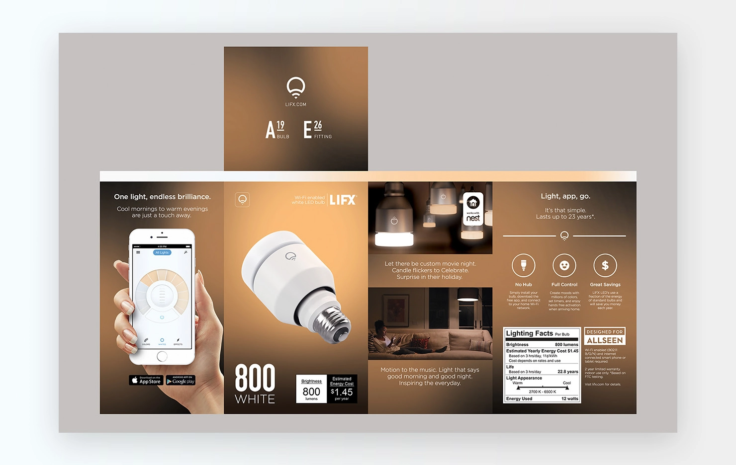
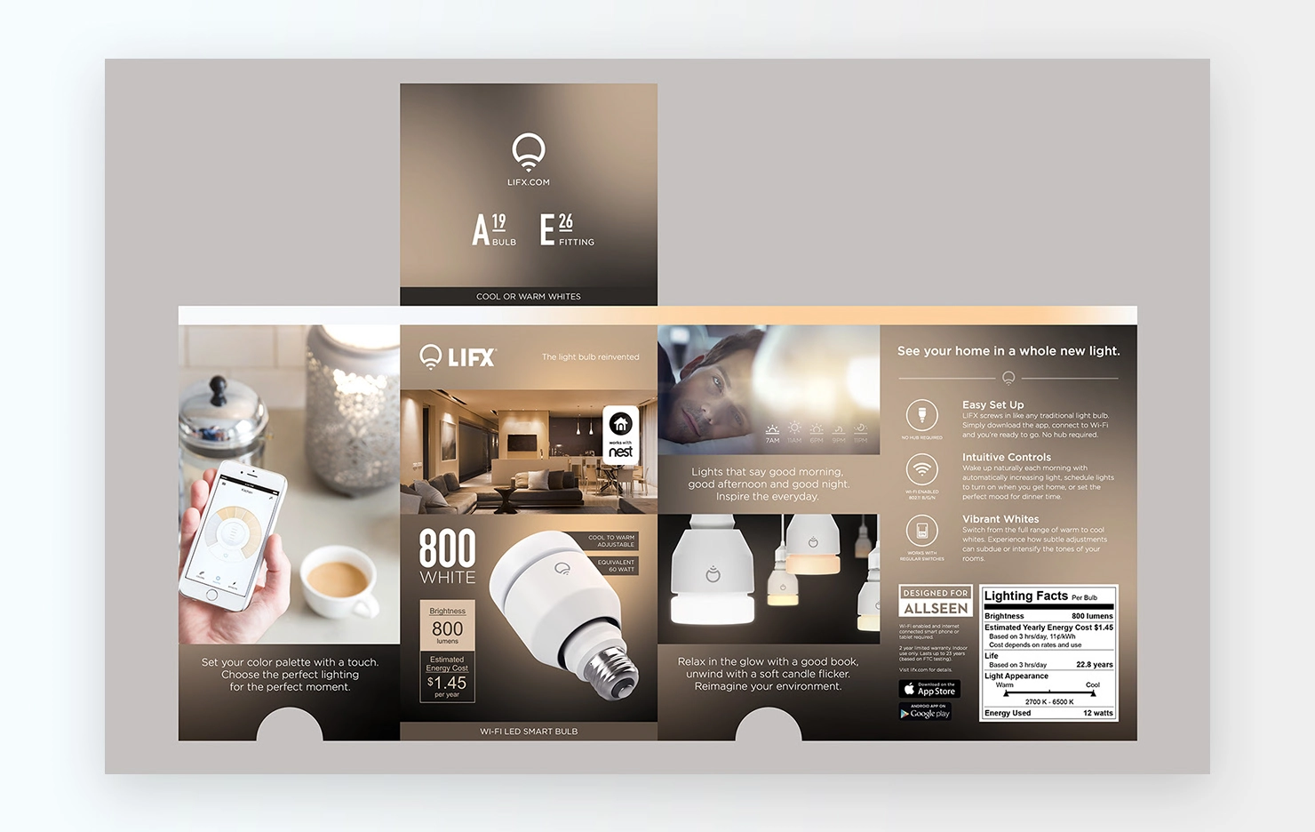
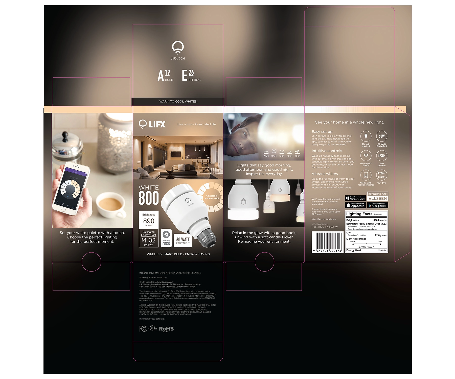
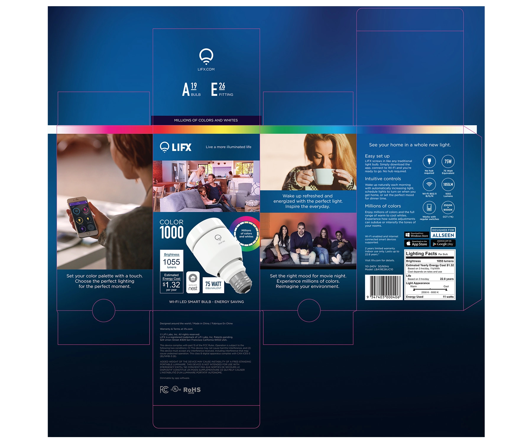
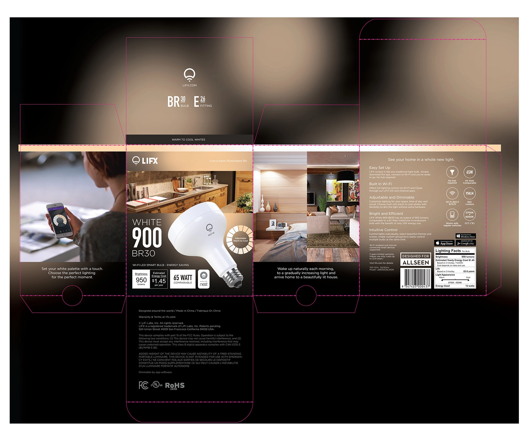
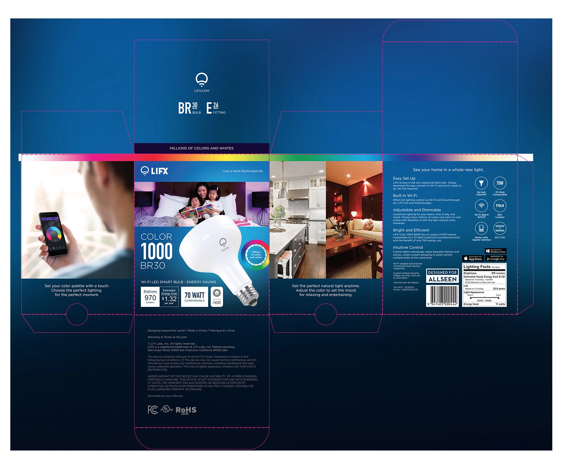
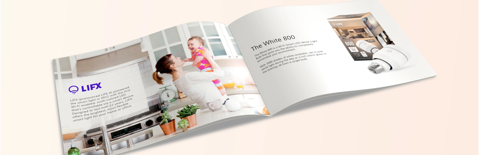
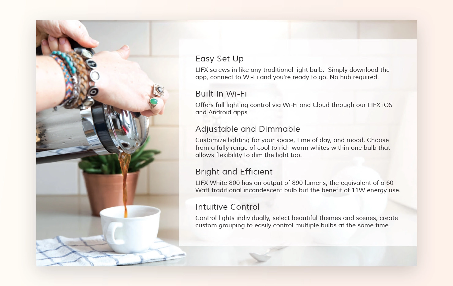
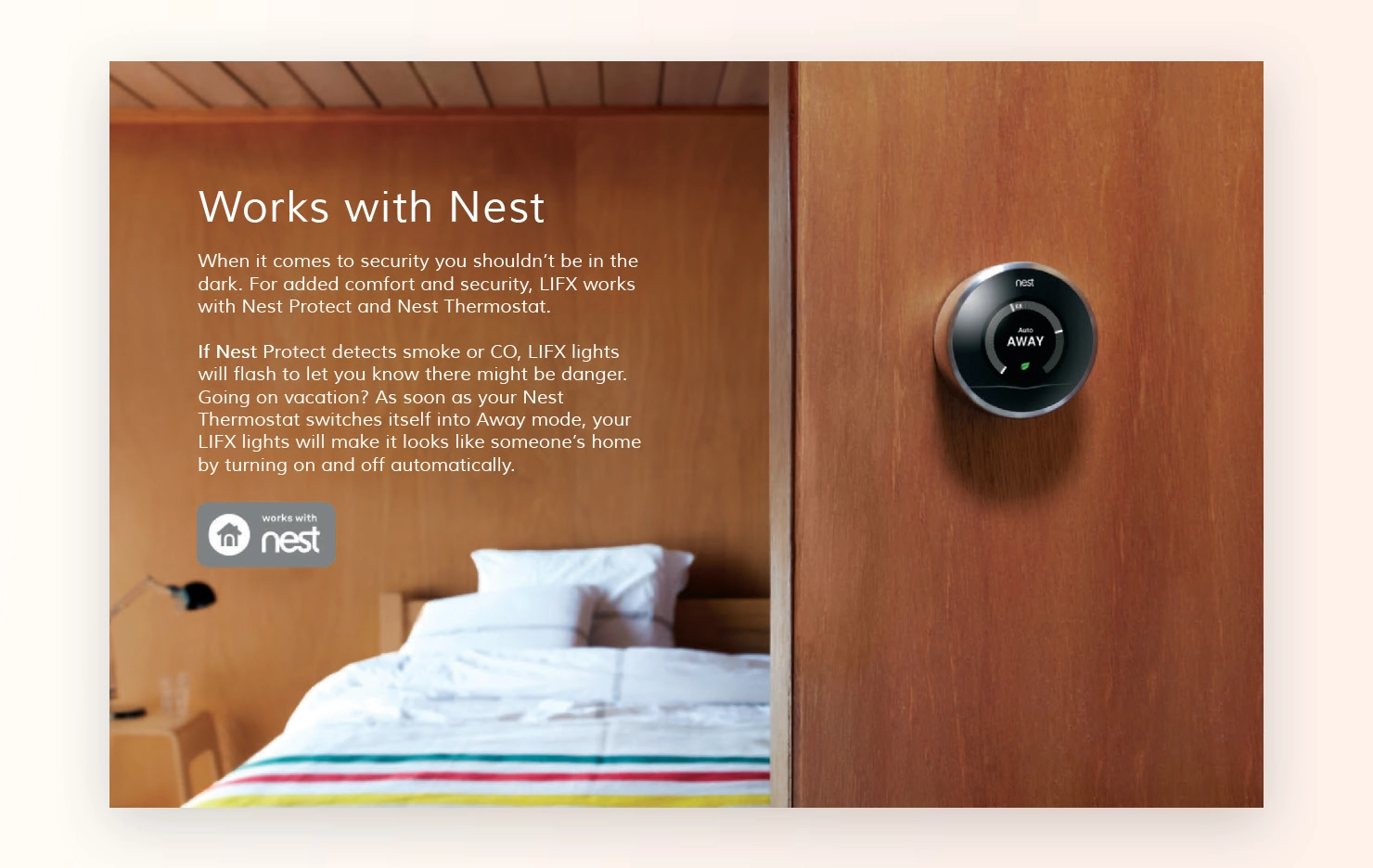
To support sales staff and enhance customer education, I developed a series of 12+ page marketing booklets that highlighted the key features and benefits of LIFX bulbs. These booklets were designed to be simple, clear, and visually engaging, making them easy to reference during customer interactions.
For the White 800, the booklet focused on the bulb’s Wi-Fi connectivity, energy efficiency, and ease of use. It was important that the content communicated these technical details in a way that was approachable, helping both sales teams and customers understand the value of the product quickly. For most customers, LIFX would be their first experience with interactive LED bulbs, and so the experience had to fresh but familiar.
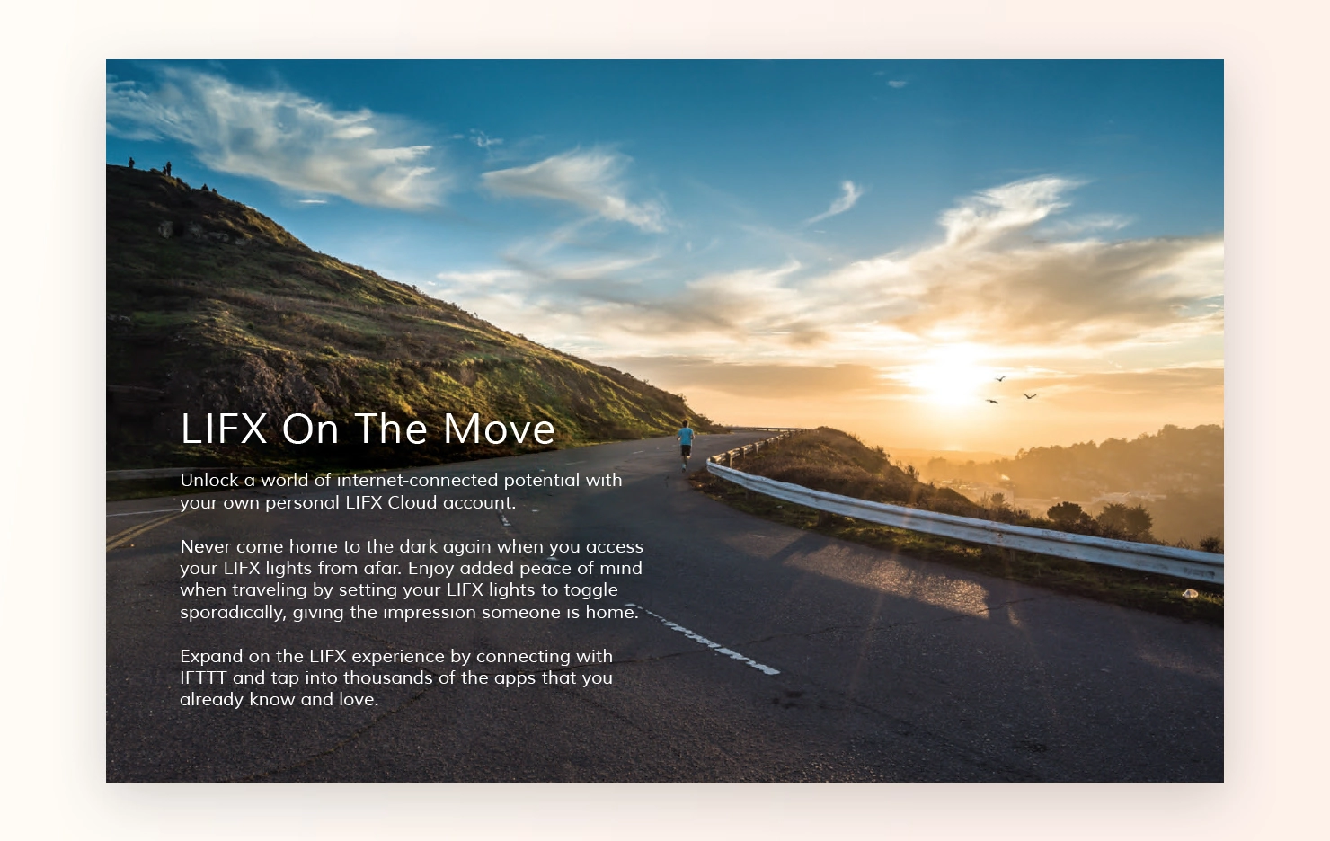
Throughout the year, we gathered feedback from various stakeholders, internal teams, customers, and sales partners. The redesigned app was praised for its clean layout and ease of use, particularly the new collapsible sections for advanced features. The packaging, too, was well received for its simplicity and bold, modern look.
Minor tweaks were made to the marketing booklets based on feedback, such as clarifying technical specifications and adjusting design elements for better readability. These refinements ensured that the materials were as effective as possible in communicating the product’s strengths.
The app redesign, packaging, and marketing materials were successfully delivered throughout the year, and subsequent year for the rollout of the new packaging. The app saw increased user engagement, particularly in the usage of scenes and automation features, while the new packaging helped differentiate LIFX products in a competitive market.
The marketing booklets provided a helpful tool for sales teams, increasing their confidence in explaining LIFX’s smart lighting capabilities to customers. The project was a success, improving the overall customer experience and boosting brand visibility both in-app and on the shelves.
About
Design has always been a natural part of who I am. Over the past 20 years, I've built a career around creating thoughtful UI/UX and brand experiences that look great and drive real business outcomes.
What I love most is the balance between creativity and strategy. I approach each project with curiosity and discipline, aligning design choices with user needs and business goals. Collaboration is key: working with teams, clients and users to create something that functions seamlessly and resonates on a deeper level.
Outside of my core work, I'm always experimenting, learning and evolving as a designer. For me, design is about creating experiences that matter and bring value to users and the teams who create them.
Personal work
Side projects push my creative boundaries, keep me sharp and let me have fun with new tools.
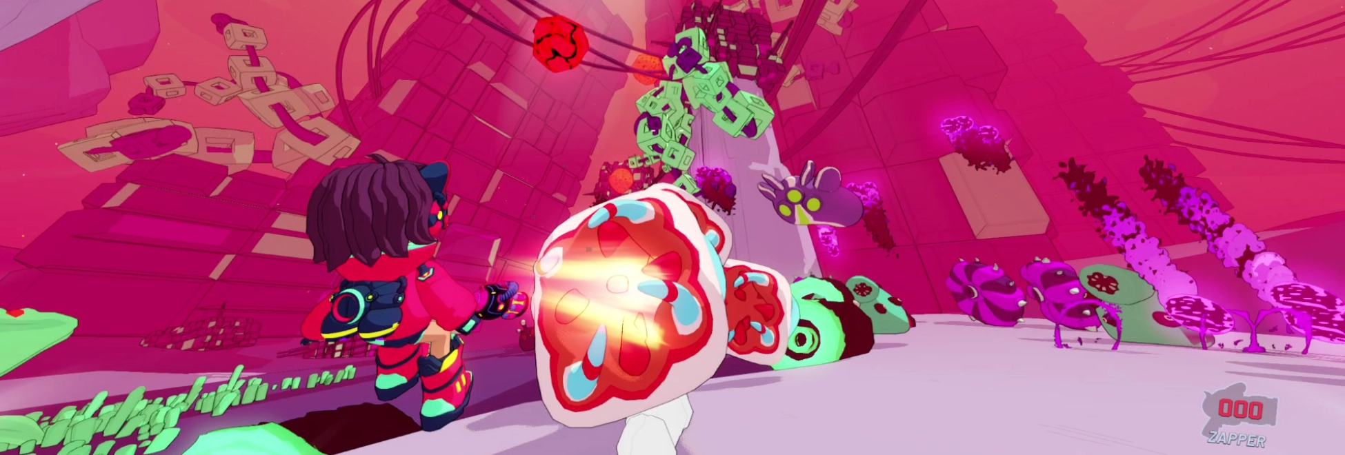
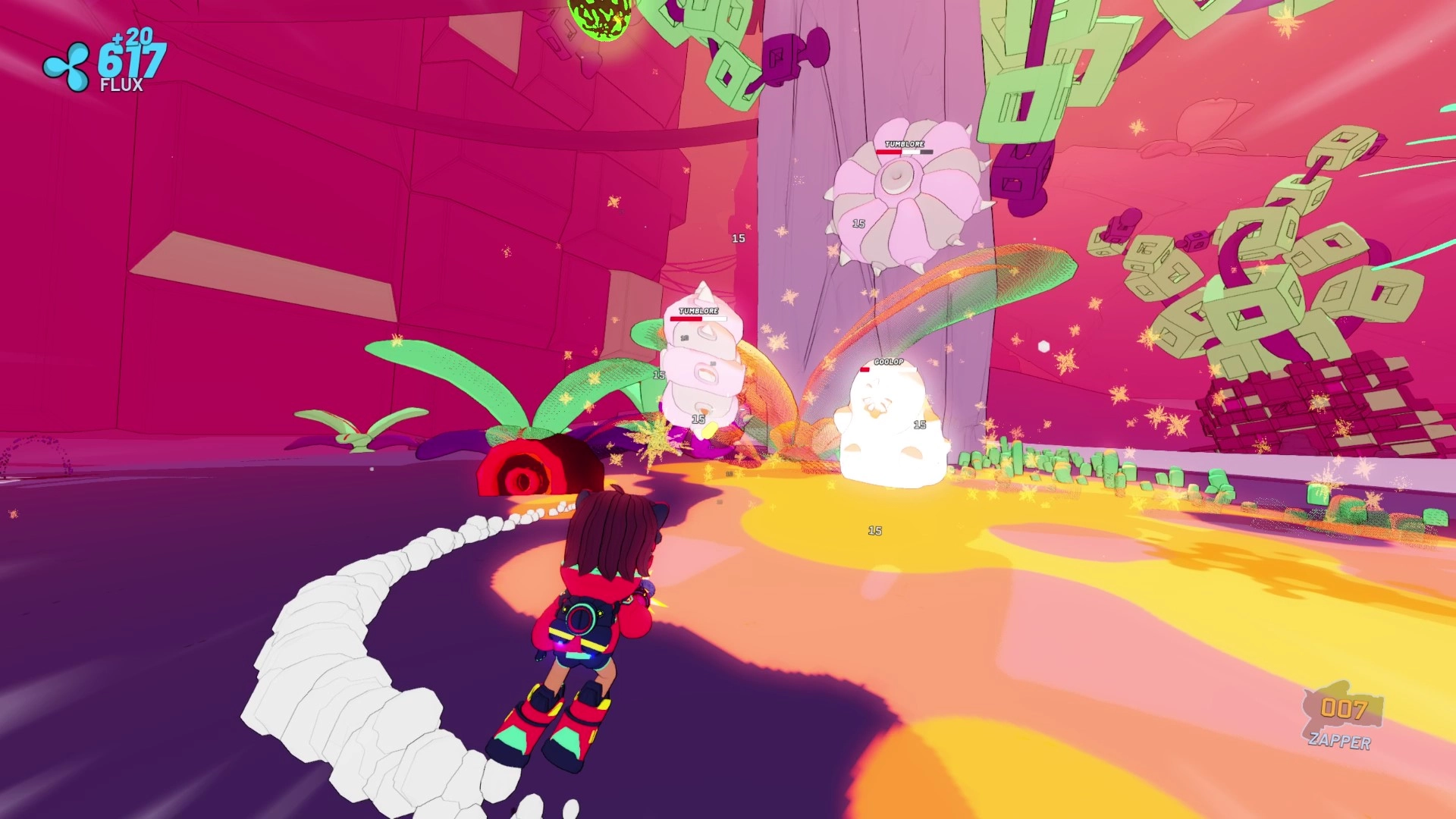
Over the course of a year, I designed and developed a fully functional game demo in Godot, complete with 3D character models, gameplay mechanics, UI design, level design, and more. The result? Rift Titans - a jetpack-powered action-roguelike where players battle creatures and survive dynamic rifts.
Personal experiment
6 months
Design a functional, vertical-slice game demo featuring 3D models, UI, dynamic environments, and core gameplay mechanics, all built from scratch in Blender and Godot.
Rift Titans started as an ambitious experiment. I wanted to build a fully functioning vertical slice of a game that could showcase my skills across multiple aspects of game development; everything from 3D modeling to level design and gameplay mechanics. Inspired by action-roguelikes, I focused on creating a fast-paced, chaotic experience where players engage in jetpack-powered combat across different stages.
The challenge was exciting! I needed to design game-ready models and environments, but I also had to implement core game mechanics, such as flying, shooting, enemy AI, loot systems, and bullet-hell style boss encounters. Additionally, I had to ensure the game was intuitive, visually appealing, and optimised for performance.
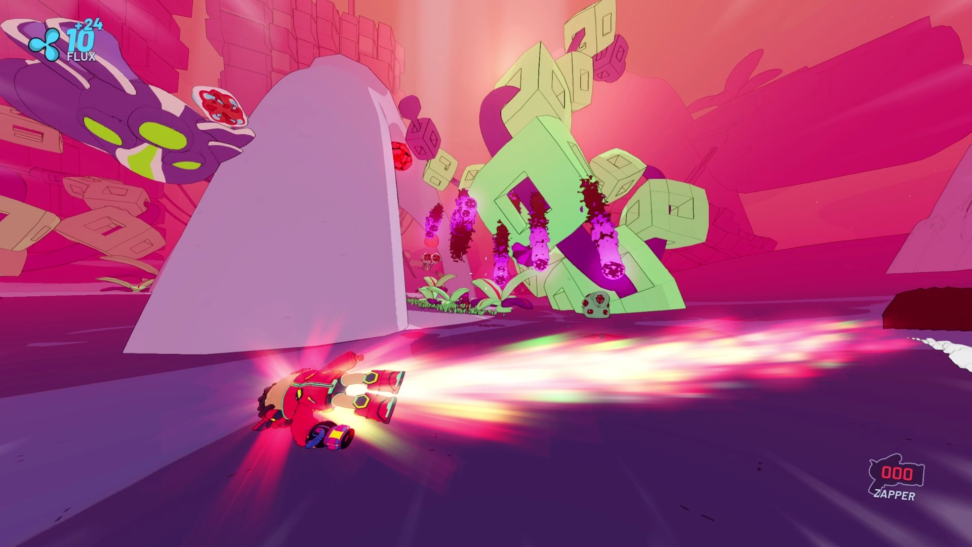
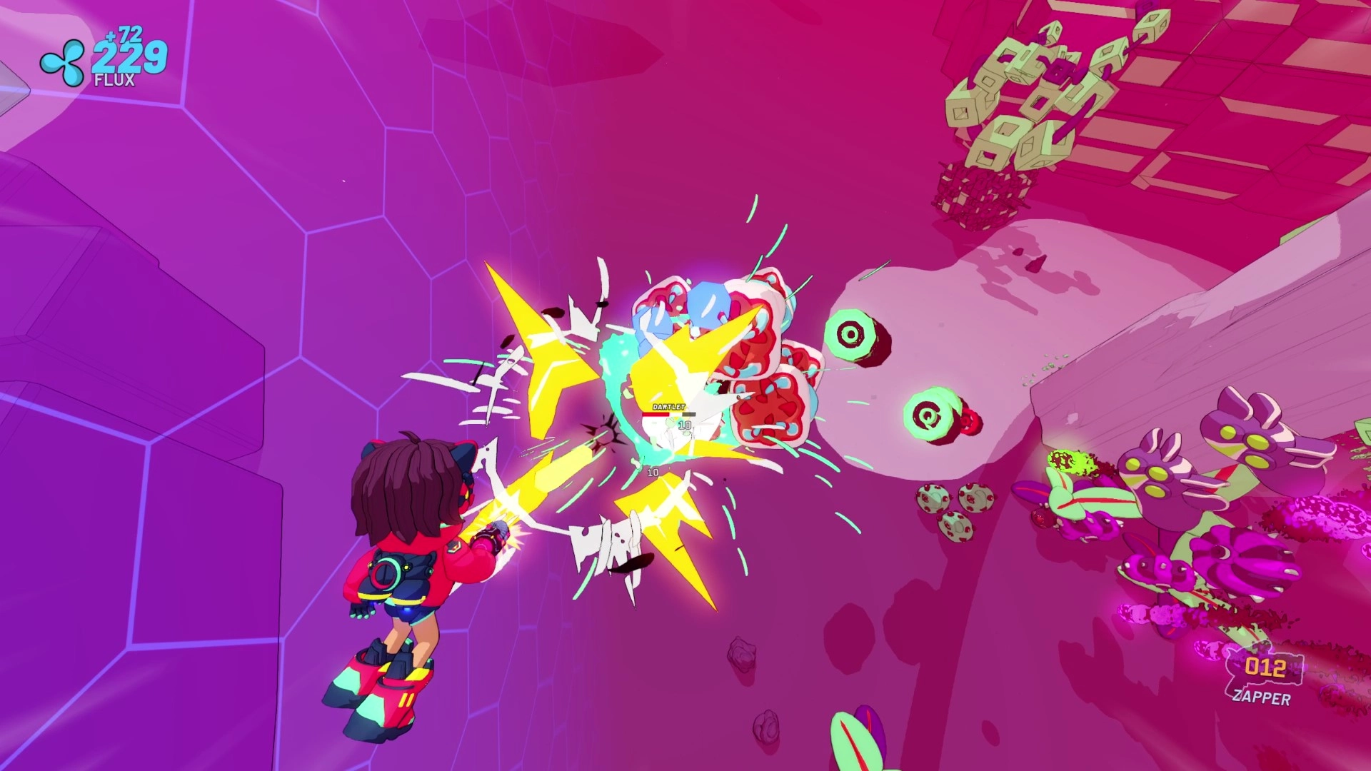
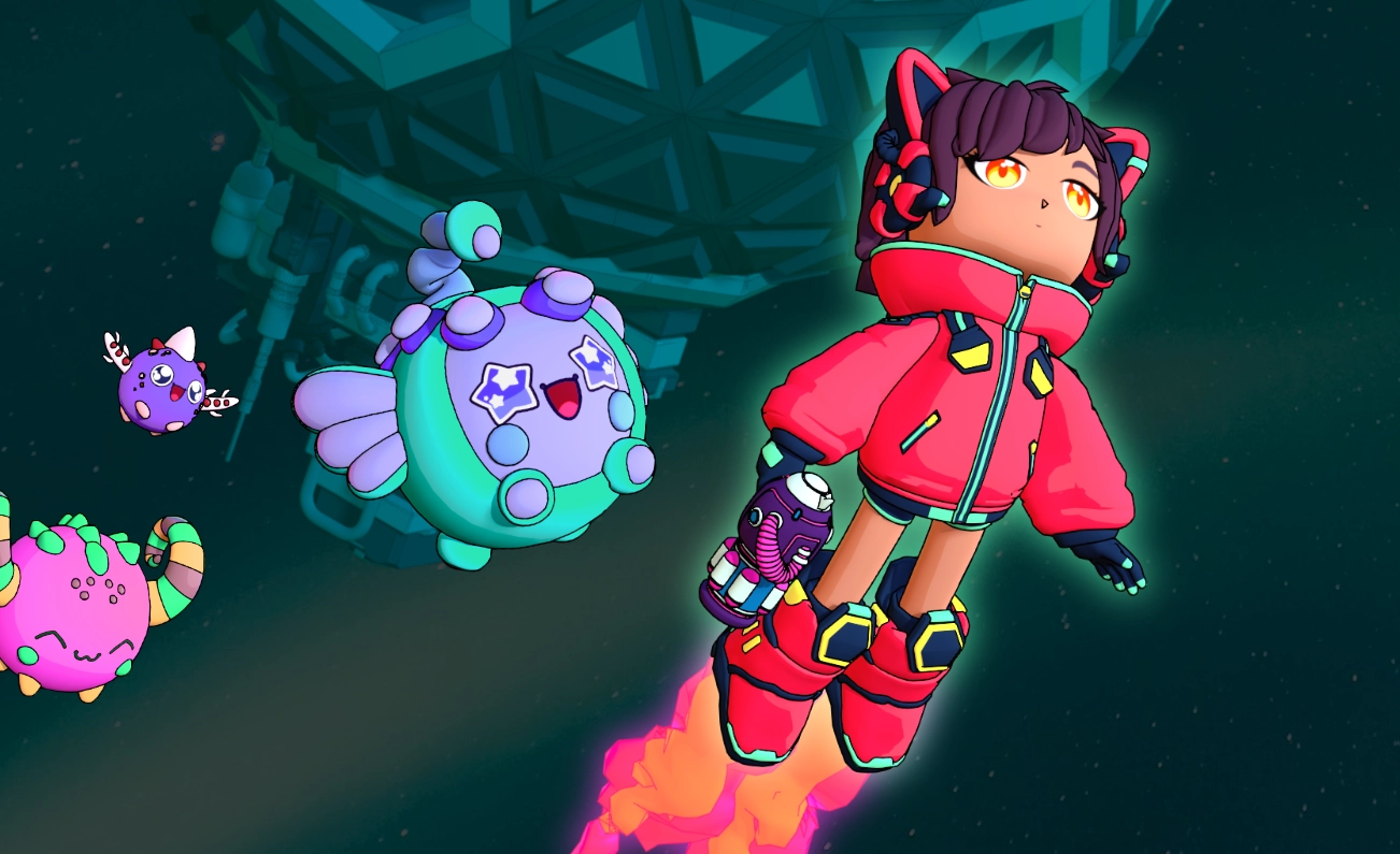
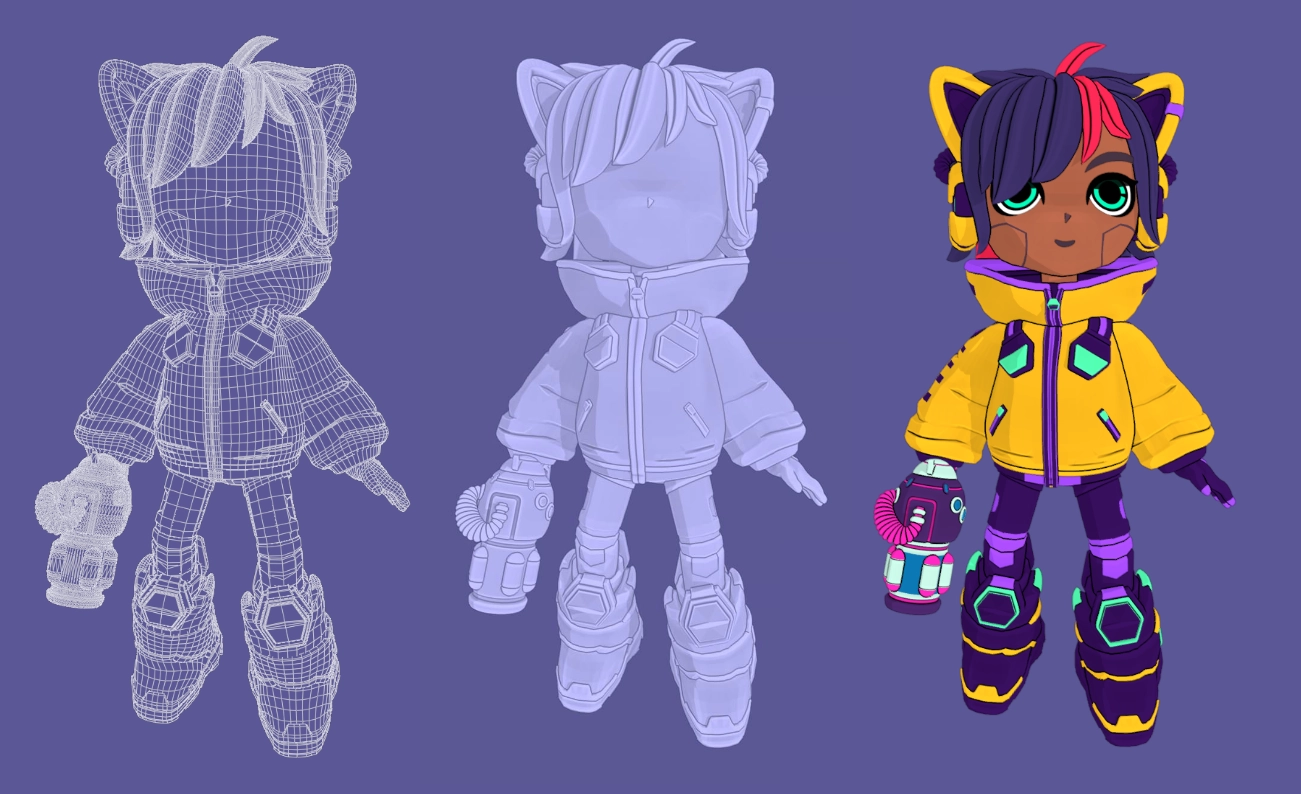
The visual design of Rift Titans required a lot of iteration. I did some concept work to find a main character 'Kira' in Rift Titans. Kira was originally planned to be in another game, but after thinking it through, I felt she could work better in Rift Titans - so I ported the concept over.
Kira's original design was inspired by the Chibi style (caricature originating in Japan, where characters are drawn in an exaggerated way, typically small and chubby with stubby limbs, oversized heads, and minimal detail). Later on through development I realised that the short stature made it much harder to hit headshots, due to the camera's position and scale relative to Kira's head/center of the screen, so adjustments were made to make her taller.
After exploring some alternative looks and styles for the model, I tweaked and adjusted the look in Affinity. After I was happy with the inital look, I used Blender to create the 3D model.
Throughout the development of the game Kira was more of a human-character with bright red features, shorts and explosed legs. As I evolved the story, Kira was to become partly robotic, so she transformed to having robotic facial check implants, robotic legs and a yellow and purple colour palette. This redesigned version of Kira was not included in the vertical slice.
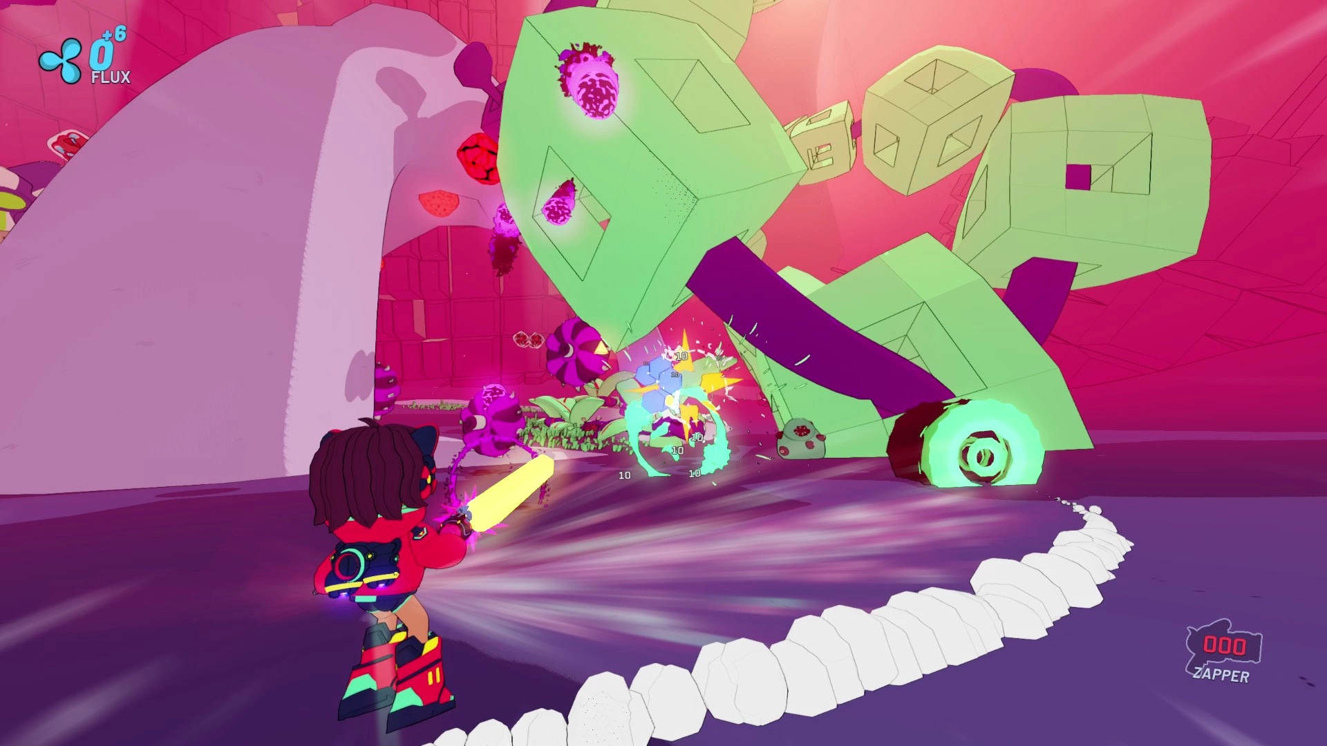
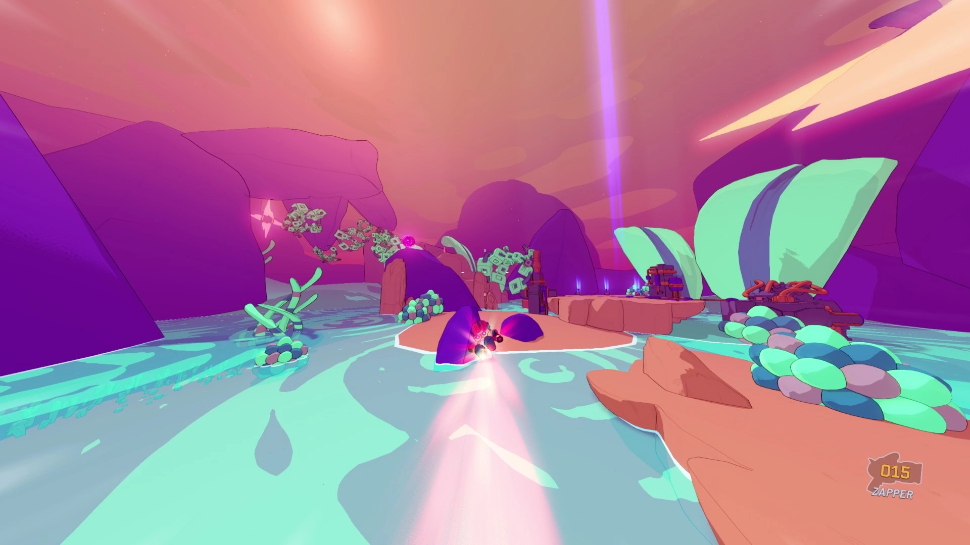
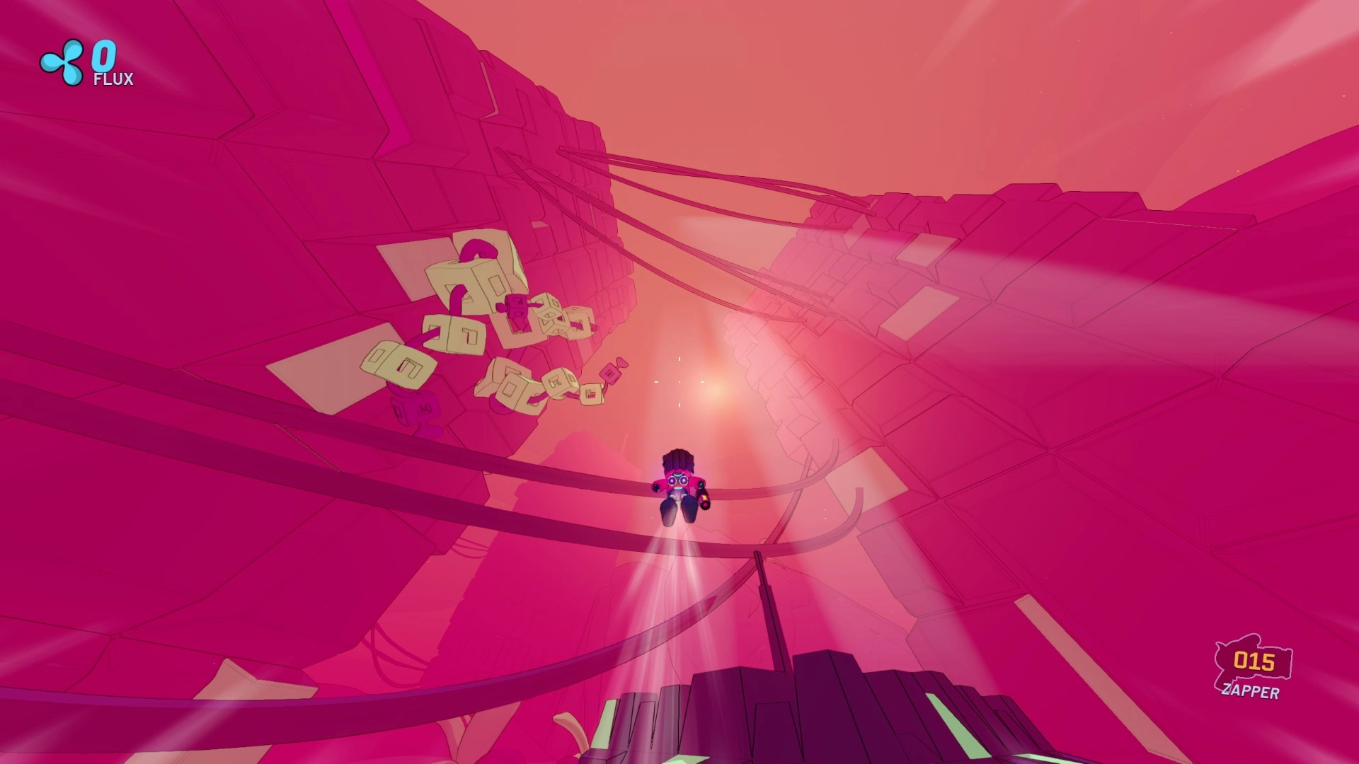
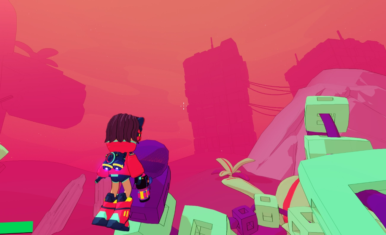
The environments in Rift Titans are carefully crafted to support immersion, visual clarity, and gameplay. I experimented with different design approaches to create worlds that not only looked striking but also enhanced the player's experience. One key example is the "sunburnt" world, where the palette is dominated by deep reds, purples, and yellows.
The design process begins with a perspective view in Godot, where I map out the essential elements; this space-efficient approach means building only what’s necessary for the player’s perspective. From this angle, the outer edges are left empty, ensuring optimal performance without compromising the visual appeal within the game’s boundaries.
In-game, I introduced a heavy fog in the distance to deepen immersion and direct the player's focus to the action in the foreground. The sky is shaded with a gradient to complement the environment's tones. To improve readability and give a distinct, stylistic look, I applied a black outline effect to objects. This outline fades with distance, leaving far-off objects in silhouette, which creates visual depth and helps players differentiate between foreground and background elements during combat.
As you will see, all the objects in the world are different colours, until the game starts. At runtime, it applies all of the worlds theme, updates the position of the colourmap texture, which "coats" the object as that colour. That's based on a common system in a lot of games where each vertice of a model is connected to one position on a colourmap, which removes the need to do 'painting' on the modal, and allows for quick colour changes by simply shifting the position of the map. This is especially useful for enemies as it allows for recolouring to align them better to the world and to avoid clashing with plants, environments and more.
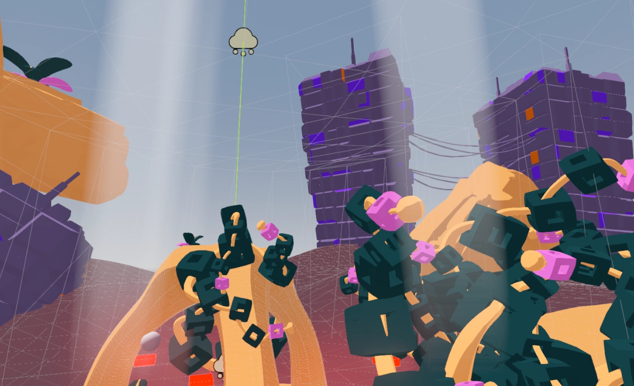
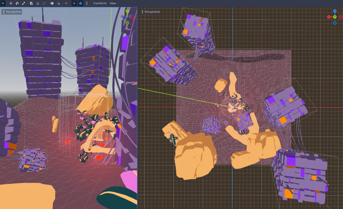
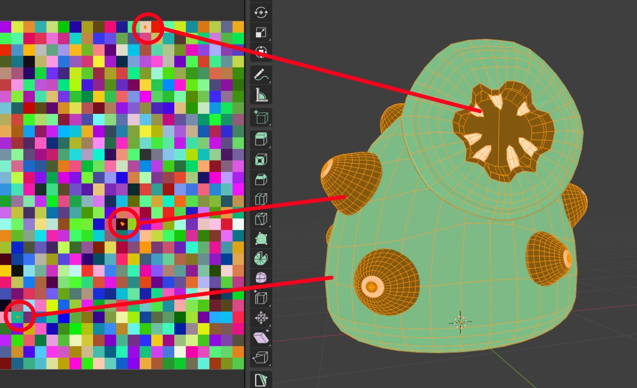
At its core, every game is a complex network of interconnected systems, much like the mindset of a UX designer when creating user flows. I’m passionate about building these systems and seeing how they work together to create a seamless experience. In Rift Titans, every action; from selecting a weapon, to managing ammo, to hitting an enemy - feeds into a larger structure that governs the game’s win conditions, progression, and mechanics.
For example, selecting a weapon isn’t just about choice; it connects to available unlocks, which impacts how effectively the player can engage enemies. Each enemy defeated triggers another set of systems that track progress, award loot, and determine when the player moves to the next stage. By designing these systems to be modular and scalable, I’ve ensured that they can be expanded upon for future stages, new enemies, and additional game modes.
An example of a smart system is the vertex animations of each enemy. By moving their vertices (think of your elbow, or fingers as points we can control) with maths I can achieve custom and randomised animations by adjusting parameters inside Godot. In this case it worked well as each creature doesn't have legs or arms so moving them with fluid motion worked perfectly. This system works really well with the blendshape animations, where just like moving the vertices we move them from where they are (mouth closed) to where we want them to be by increasing a variable (mouth open). This creates variety, motion and animation in-game with much less work across 20-30 enemies.
This video demonstrates the core gameplay mechanics of Rift Titans, showcasing a complete flow from weapon selection to combat and loot collection. In this vertical slice, you can see how Kira starts the mission, engages in aerial combat, and survives the enemy onslaught using dynamic movement and shooting mechanics. After clearing all enemies, the player collects loot and prepares for the next stage.
While the demo focuses on gameplay flow, combat mechanics, and timing, it provides a clear sense of the game's core features; gameplay pacing, various enemy AI behaviors, and a satisfying combat loop.
Note: Only a few sound effects have been integrated, no bullet-hell boss is shown in this slice and enemy damage is minimal - so the emphasis remains on the visuals and gameplay experience as a concept only.

I challenged myself to design and develop a fully functional app in under a month. The result? A browser-based Zen garden where users can draw in the sand and create their own peaceful space, all while integrating complex features like authentication, cloud storage, and payment systems.

Personal experiment
1 month
Create a themed, browser-based drawing app using HTML canvas, complete with authentication, cloud storage, and payment integration, all within a 30-day timeframe.
I wanted to push my boundaries and set myself a challenge: design and develop a complete app in under a month. The goal was to create something that not only worked technically but also offered users a meaningful experience. I wanted to combine my interest in the HTML canvas with a themed concept, and after some exploration, the idea of a Zen garden came to life. A place where users could draw in the sand, arrange rocks and plants, and create their own peaceful scene.
The project was more than just a creative exercise; it was an opportunity to push my limits in both design and development. Having never built a drawing tool on canvas before, I was eager to dive in and learn something new. On top of that, I had never used Firebase or launched a fully complete app from scratch, so every aspect of this project was a new challenge. The self-set timeline was tight, but balancing creativity with technical learning kept me motivated throughout the process.

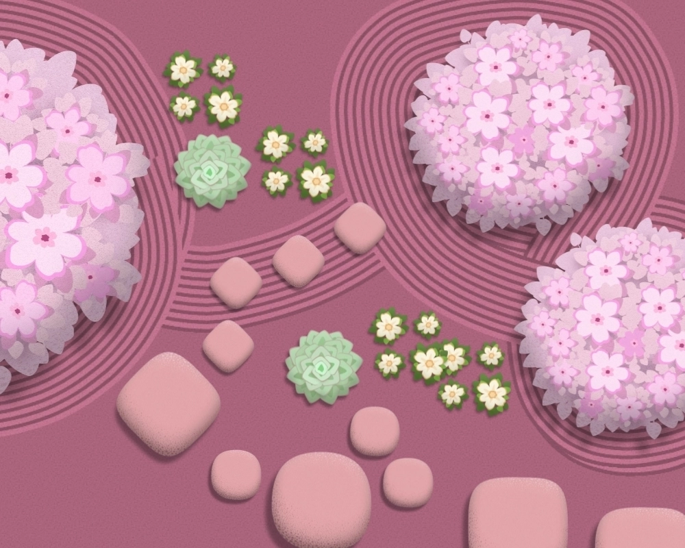
Designing this app required a lot of thought. I created custom assets such as rocks and plants to keep the Zen theme consistent and aesthetically pleasing. The goal was to make sure that each visual element was consistent to the experience. I spent time crafting an interface that felt intuitive and subtle, where users could easily interact while feeling in control of the creative process.
On the technical side, I integrated Firebase for user authentication and cloud storage, allowing users to save their gardens. Despite having no prior experience with Firebase, I quickly learned how to implement it and make it work seamlessly. I also implemented Stripe for payments, enabling a smooth and secure transaction process. My focus throughout was to keep the design light and responsive, ensuring the app worked seamlessly across different devices without compromising performance or aesthetics.
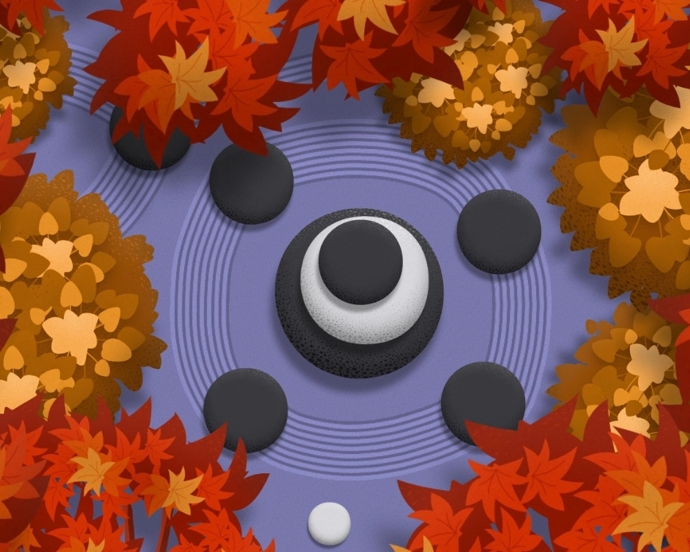
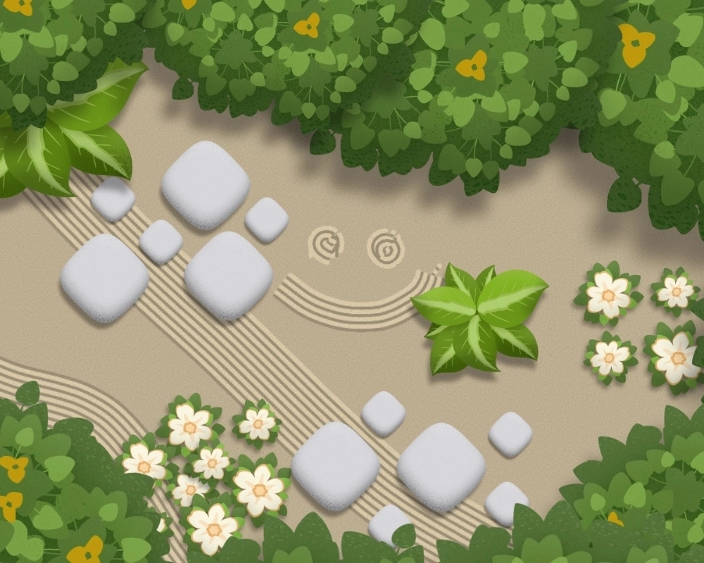
The Zen Garden app offers users multiple customisation options. Users can adjust the size/grooves of the rake while drawing to create different patterns in the sand, place a variety of rocks and plants, and even change the sand's color to suit their mood.
I worked hard to ensure that each feature added to the overall user experience. Whether it’s the ease of drawing with the rake or placing objects in the garden, every detail was carefully considered. My goal was to deliver a product that felt seamless and allowed users to immerse themselves in the act of creation without distraction.
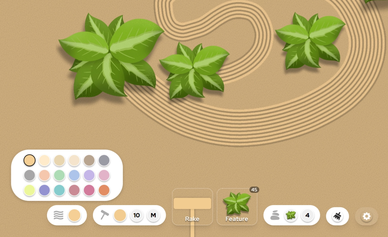
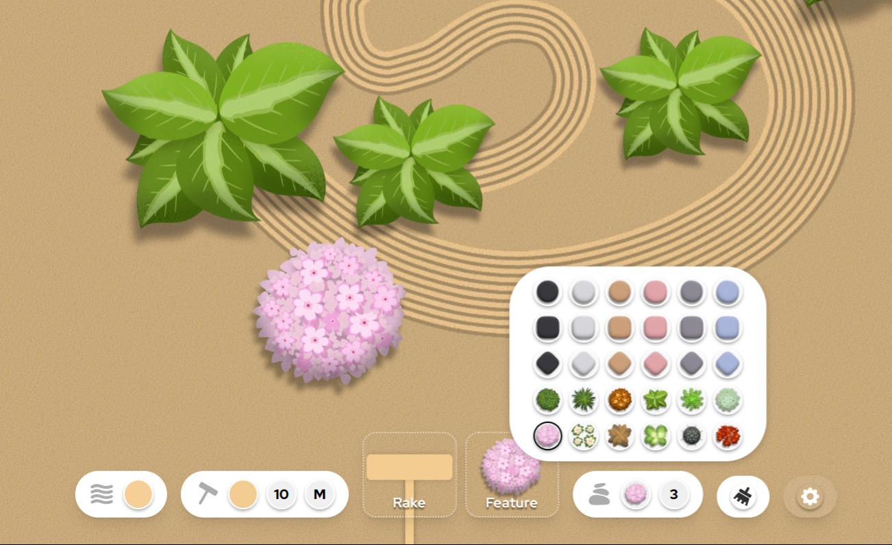
This project taught me valuable lessons about balancing creativity with functionality. I successfully built and delivered a complete app within 30 days, meeting my technical goals while crafting a product that provides value to users. Having never launched a fully finished product before, this was an incredibly rewarding experience that pushed me beyond my comfort zone. Working with the HTML canvas opened up new possibilities for interactive design, and integrating complex systems like payments and authentication pushed me to refine my technical skills.
Most importantly, this project reinforced why I’m passionate about design. It’s not just about making something visually appealing - it’s about creating experiences that resonate with people, even if on a small scale. While the Zen Garden app didn’t gain widespread attention, it was a powerful learning experience that pushed my creative and technical boundaries.